Call to action buttons are button links we use strategically to draw attention to the primary action we want users to take on a page.
Getting Started Tips
- Use buttons only for important actions you want users to take on your site, such as "Join Our Email List" or "Report a Concern".
- Never use buttons to link to bookmarks/anchors on the same page. Use a resource listing or bullet list instead.
- "Submit" and "Delete" buttons should only be used once per page.
- Avoid using too many buttons on a page.
- Title Case is most commonly used in buttons. Use UPPERCASE sparingly because can be viewed as shouting.
- Make the first word of the button a verb if possible—show the action you want the user to take. Use "File a Complaint" instead of "Complaint Filing."
Add a Call to Action Button
To add a call to action button to your content, place your cursor in the spot where you want the button to be and click the UO Edit Suite Templates icon. (Visit the Drupal Content Editor page to learn about the editor toolbar.)
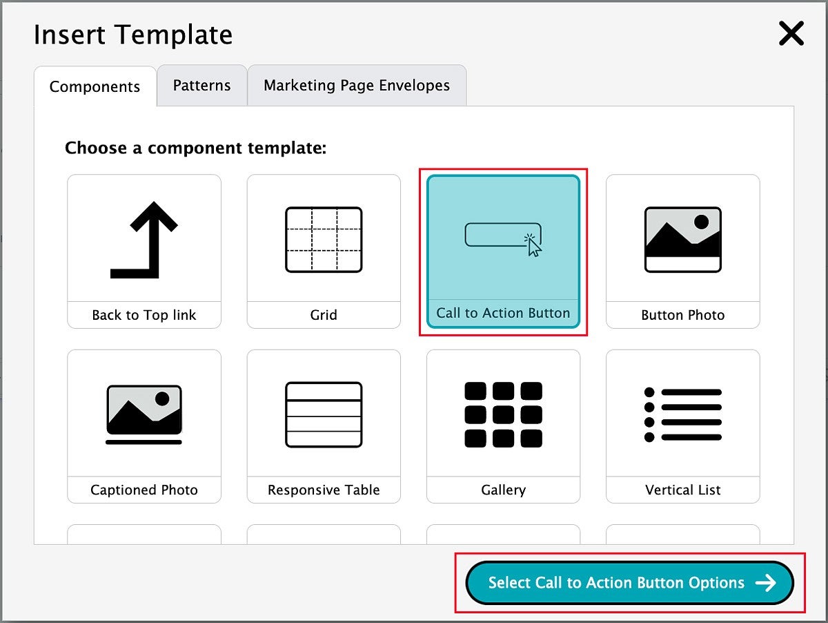
This will bring up the Insert Template pop-up window.
Buttons can be used on their own, or you can insert a grid first, and then add a button to each grid item.
To add a Call to Action Button, select the option labeled "Call to Action Button" in the top row. Then click the "Select Call to Action Button Options" button.
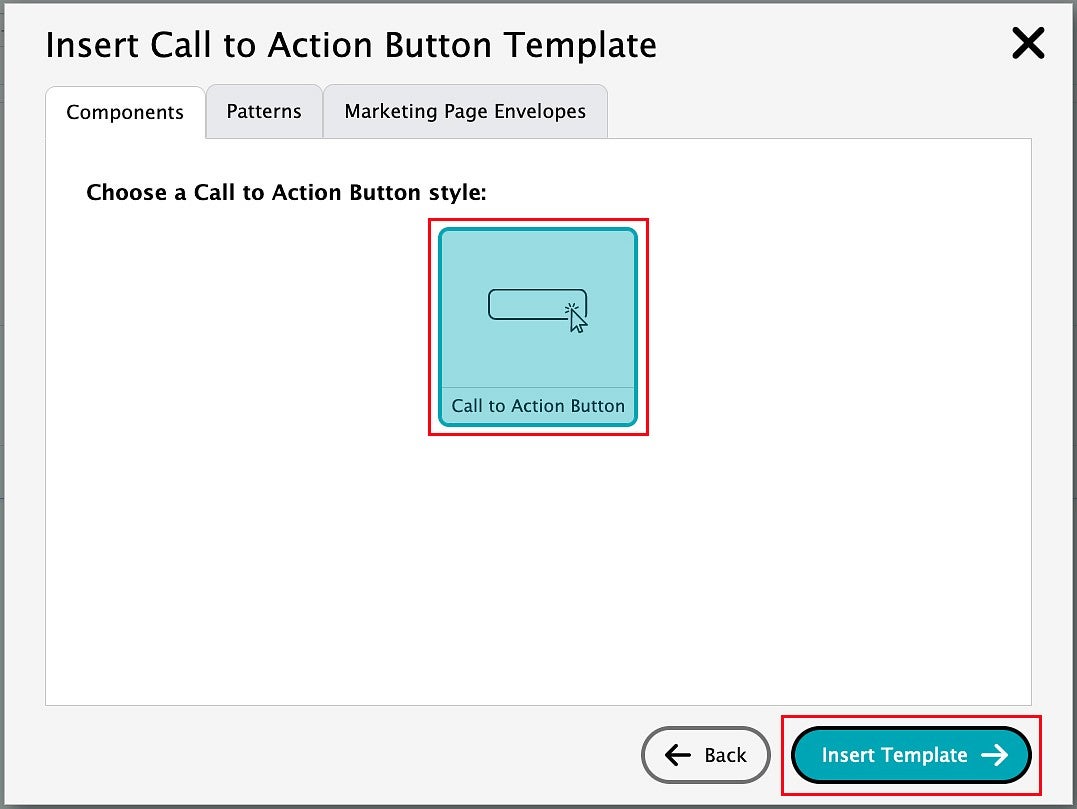
At the moment, there is only one Call to Action Button style.
Select the Call to Action Button style and then click the "Insert Template" button.
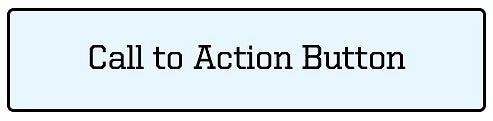
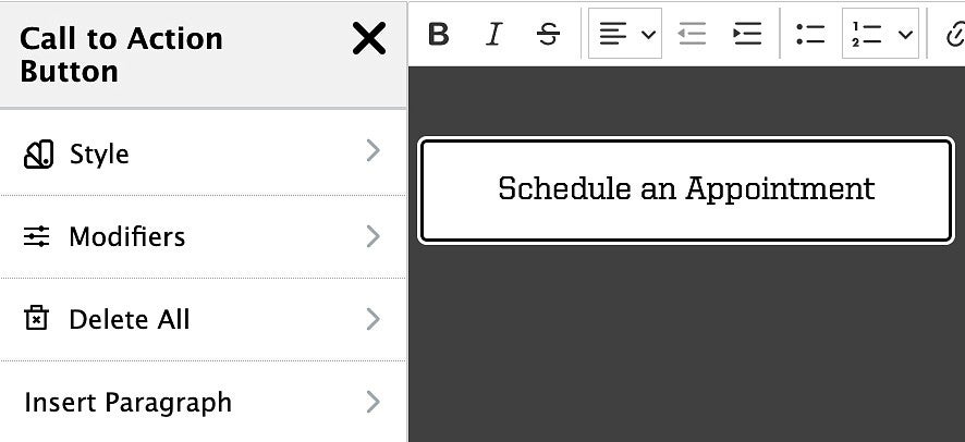
A standard call to action button will be inserted into your page, like the example below.
Edit the Button Text
Highlight the default "Call to Action Button" or other button text.
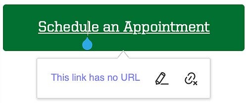
Type in your new button link text. In this example, we will use "Schedule an Appointment" as our button link text.
NOTE: There is a bug in the some versions of Edit Suite. When editing a button, another button may appear to the side of the button you are creating.
If this happens, ignore the new button and click in the area below your button. The new button should disappear.
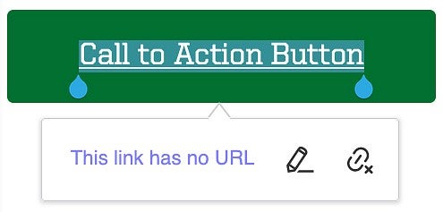
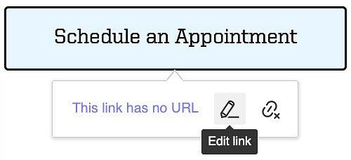
Add or Edit a Button Link
Highlight the entire text in your button, then click the pencil icon to begin editing the button link.
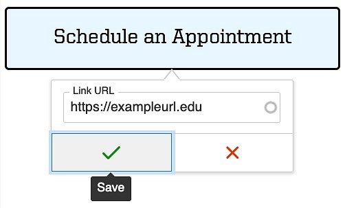
Paste or type the destination URL into the Link URL field. If this is content or an internal page on your site, type in the file name or the page name.
The Link URL will be automatically updated to that content's URL on the site and will be something like /node/123 or /media/1234. This internal or relative link URL is the URL to use as using absolute link URLs on your site has the potential to cause issues.
Click the Save button when you have added your URL, which features a green check mark.
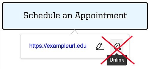
NOTE: Clicking on the Unlink icon is not recommended. Doing so will remove the button, leaving your link text as plain text on the page. If you want to remove an existing link but keep your button intact, click on the pencil icon to edit the link.
Edit Button Styles
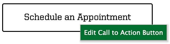
Right-click the button you have created and click "Edit Call to Action Button" to begin editing the button.
A Call To Action Button editing menu will open on the left side of the page, offering the following editing options: Style, Modifiers, Delete All, and Insert Paragraph
Here is an example of the Call to Action Button editing menu on the left, with the button on the right:
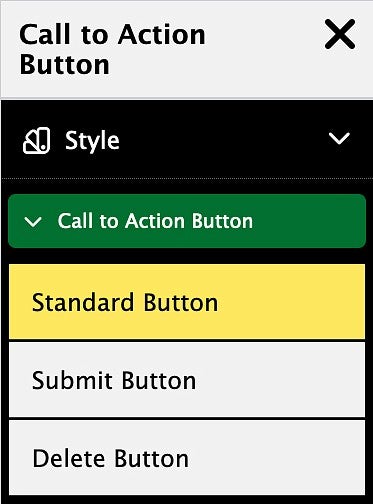
Style
Click on the Style option, then click "Call to Action Button" to open the menu.
The style options are Standard Button, Submit Button, and Delete Button.
Do not create new button colors. Call to Action buttons are carefully formatted to respond to background colors and templates to meet accessibility, functionality, and UO brand requirements.
- "Standard Button" is the default style and should be used most of the time.
- "Submit Button" is a green button style that should be used sparingly for a primary page action like submitting, applying, or donating.
- "Delete Button" is a red button that should be used only for destructive actions like "Delete Account."
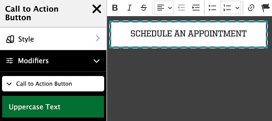
Button Modifiers
The only modifier available for buttons is the option to use all uppercase text, rather than the standard title case.
Click "Call to Action Button" under Modifiers, and then click the "Uppercase Text" button to toggle uppercase on and off.
Title case is most commonly used in buttons. Use UPPERCASE sparingly because can be viewed as shouting.
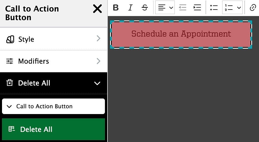
Delete All
The Delete All section of the Call to Action Button edit menu allows you to delete the button fully from the page.
Click "Call to Action Button" and mouse over the "Delete All" button. The button you are about to delete is highlighted in red. Click to delete the button.
You may be able to recover your deleted button if needed by clicking the Undo icon in the editor toolbar.
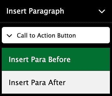
Insert Paragraph
To insert an empty paragraph above or below a call to action button, click on the