Getting Started Tip
A responsive table is a table that breaks down to one column while retaining its row/column structure on mobile devices which makes it easier for users to associate the related data in the individual table items.
If you do not need to maintain the row/column structure, then you should probably use a grid.
If you are on a computer and want to see what your responsive table will look like on a mobile device, you can adjust the width of your internet browser's window (drag your browser window from the left to make it very narrow) or zoom in on the view.
Add Responsive Tables
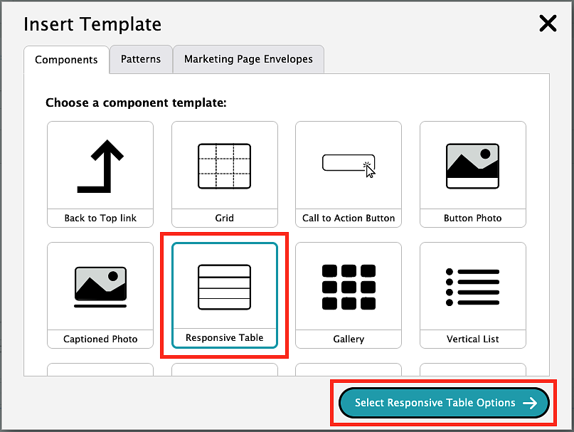
To add a responsive table, you will need to click on the template icon in the editor toolbar.
Choose the option labeled "Responsive Table," then click the "Select Responsive Table Options."
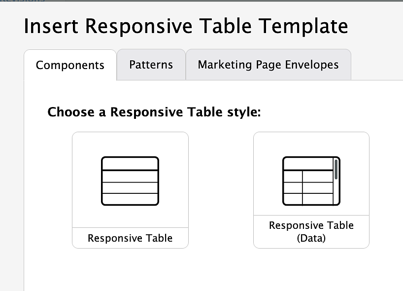
Select a Responsive Table Style
Select which Responsive Table option you want to add. There are two types of responsive tables—regular and data. A regular responsive table is for a basic table with a few rows and a few columns, which breaks down into one column while keeping the header information attached to the cell data. A data table is for significant, mathematic tabular data, which compresses but retains its shape on mobile devices but allows for you to scroll left and right to see the information.
Once you have selected the responsive table option you want, click the "Insert Template" button.
Example of a Responsive Table
Header 1 | Header 2 | Header 3 | Header 4 | Header 5 |
|---|---|---|---|---|
Cell 1 This is a line of text showing how the cells will stack when placed inside of a responsive table. | Cell 2 This is a line of text showing how the cells will stack when placed inside of a responsive table. | Cell 3 This is a line of text showing how the cells will stack when placed inside of a responsive table. | Cell 4 This is a line of text showing how the cells will stack when placed inside of a responsive table. | Cell 5 This is a line of text showing how the cells will stack when placed inside of a responsive table. |
Cell 6 | Cell 7 | Cell 8 | Cell 9 | Cell 10 |
Example of a Responsive Data Table
Header 1 | Header 2 | Header 3 | Header 4 | Header 5 |
|---|---|---|---|---|
Cell 1 This is a line of text showing how the cells will stack when placed inside of a responsive table. | Cell 2 This is a line of text showing how the cells will stack when placed inside of a responsive table. | Cell 3 This is a line of text showing how the cells will stack when placed inside of a responsive table. | Cell 4 This is a line of text showing how the cells will stack when placed inside of a responsive table. | Cell 5 This is a line of text showing how the cells will stack when placed inside of a responsive table. |
Note: Table sizes are based on their contents. If you need to make your table or your table columns be a specific size the only way to do this is in the source code view accessed by the "Source" button in the editor menu. You can find information about custom table sizing options in the "Advanced table styles" section.
Add Rows
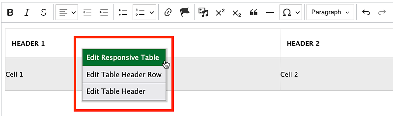
To add responsive table rows one row at a time, right click anywhere within the table and select the "Edit Responsive Table" option. This will bring up the sidebar editor.
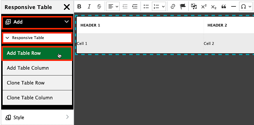
From the sidebar menu, select the "Add" option then "Responsive Table." Click "Add Table Row" to insert a new row. This will add a responsive table row just below your last current responsive table row.
Clone a Table Row
From the same sidebar menu as above, you can select "Clone Table Row" to clone your last current responsive table row.
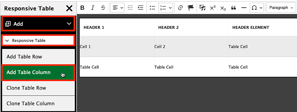
Add Columns
From the sidebar menu, select the "Add" option then "Responsive Table." Click "Add Table Column." This will add a responsive table column to the right of your last current responsive table column.
Clone a Table Column
From the same sidebar menu as above, you can select "Clone Table Column" to clone your last current responsive table column.
Note: Responsive tables will exceed the page width if there are too many columns. This is because all columns have a minimum width to prevent words from being squished into a vertical one letter wide format.
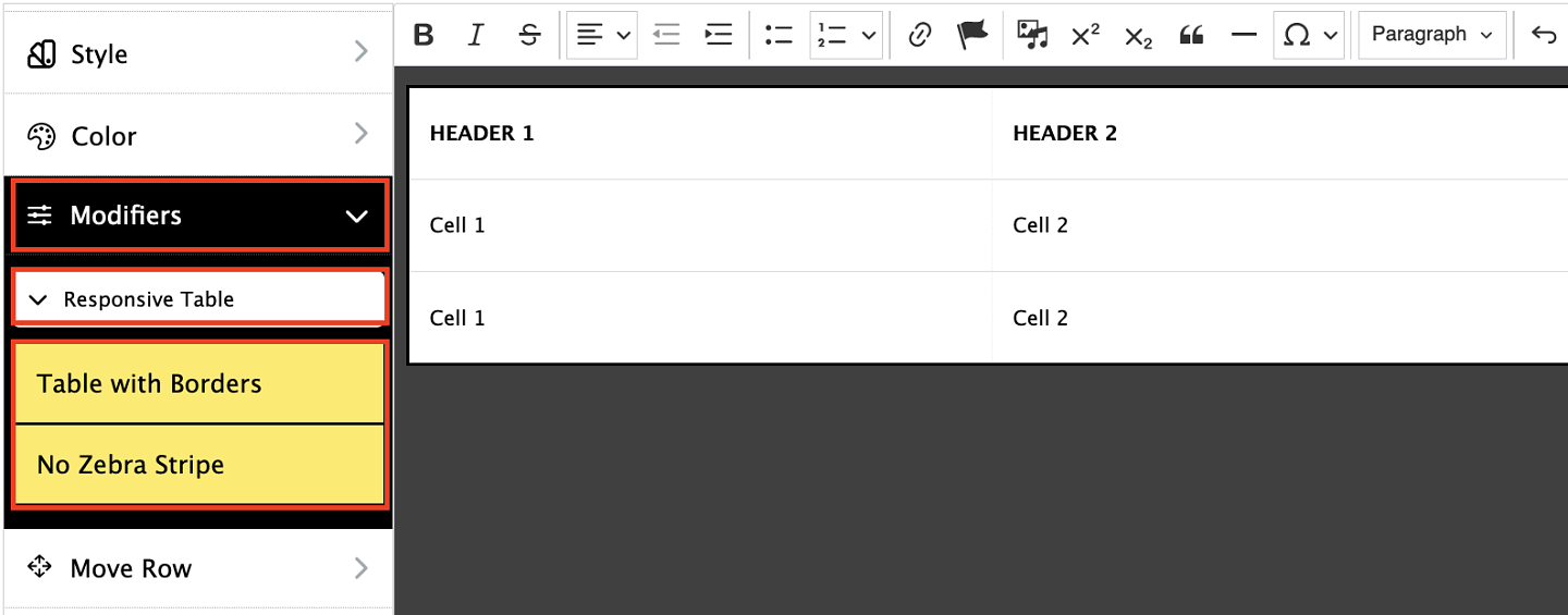
Responsive Table Modifiers
Responsive tables are automatically defaulted to have zebra striping (alternative rows of light and dark backgrounds) and no borders. Using the modifiers, you can remove the zebra striping or add borders to your responsive tables. To do this, right click anywhere within the table and select the "Edit Responsive Table" option. This will bring up the sidebar editor. Select "Modifiers" then "Responsive Table." Note that when options are highlighted in yellow, they are currently being applied to your table.
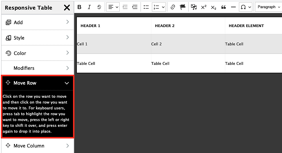
Rearrange Rows
To rearrange rows, right click anywhere within the table and select the "Edit Responsive Table" option. This will bring up the sidebar editor. Select "Move Row," click on the row you want to move, and then click on the row you want to move it to. For keyboard users, press tab to highlight the row you want to move, press the left or right key to shift it over, and press enter again to drop it into place.
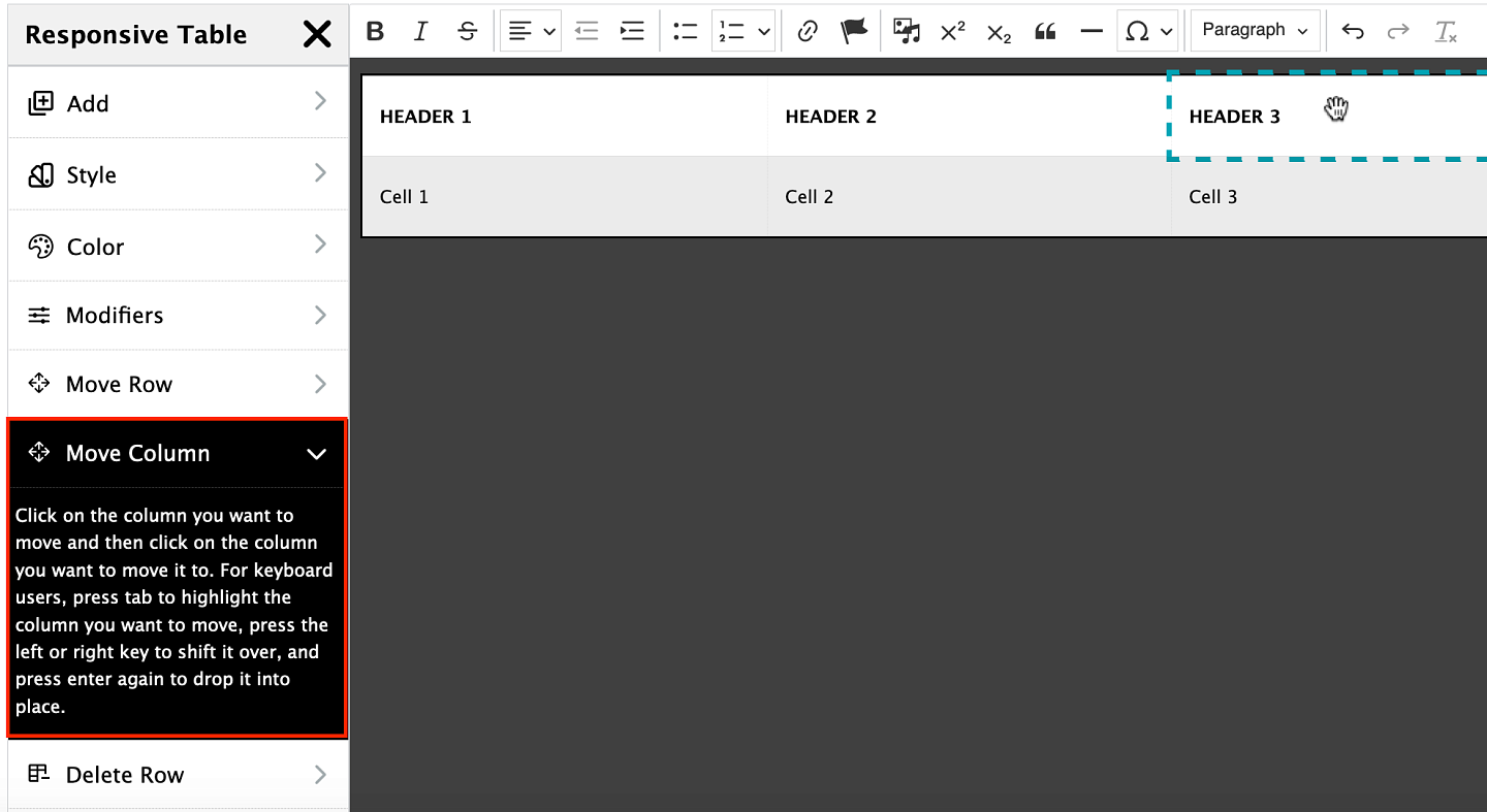
Rearrange Columns
To rearrange columns, right click anywhere within the table and select the "Edit Responsive Table" option. This will bring up the sidebar editor. Select "Move Column," click on the column you want to move, and then click on the column you want to move it to. For keyboard users, press tab to highlight the column you want to move, press the left or right key to shift it over, and press enter again to drop it into place.
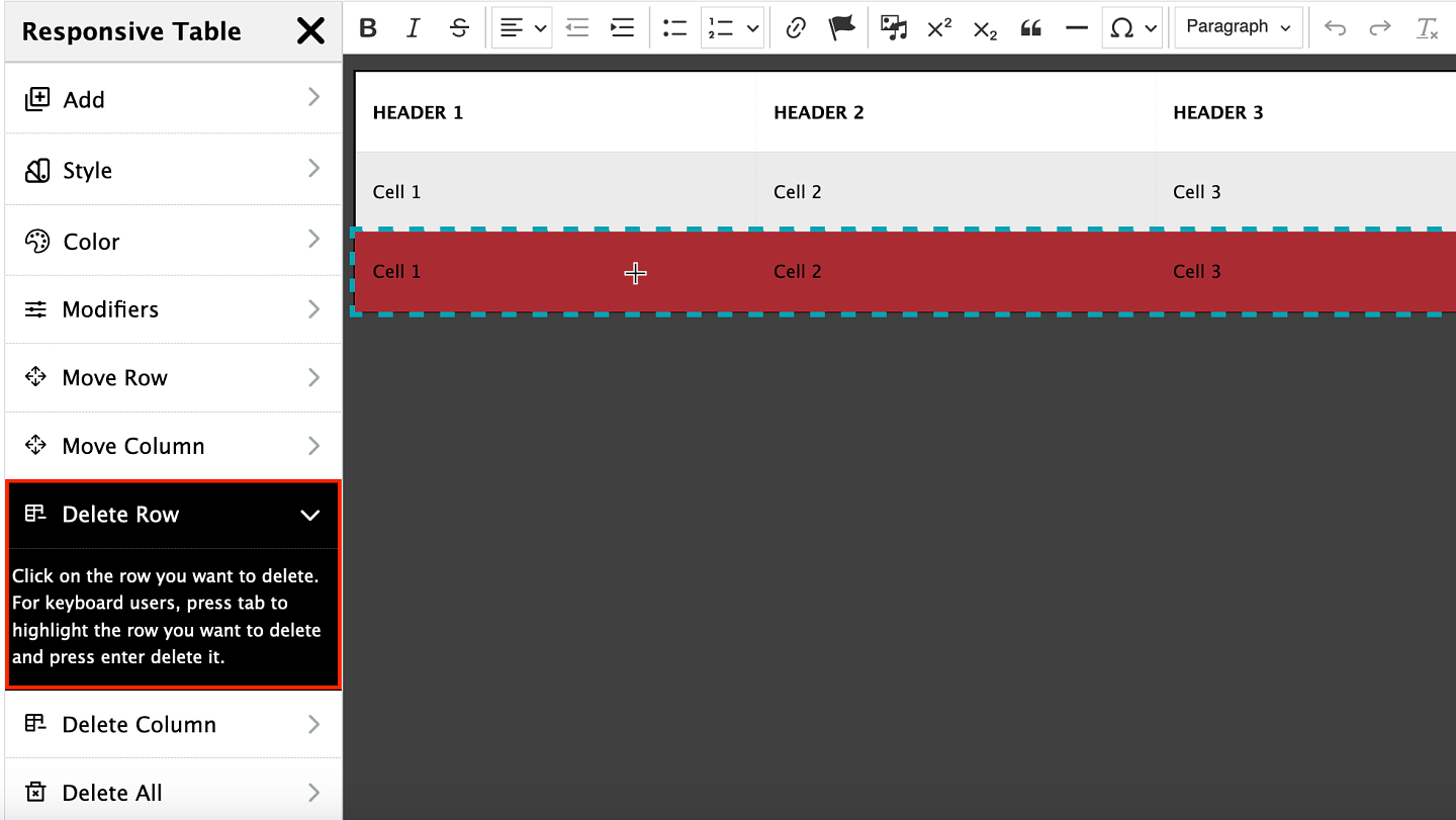
Delete Rows
To remove a table row, right click anywhere within the table and select the "Edit Responsive Table" option. This will bring up the sidebar menu. From the sidebar menu, select "Delete Row" and click on the row you want to delete. For keyboard users, press tab to highlight the row you want to delete and press enter delete it.
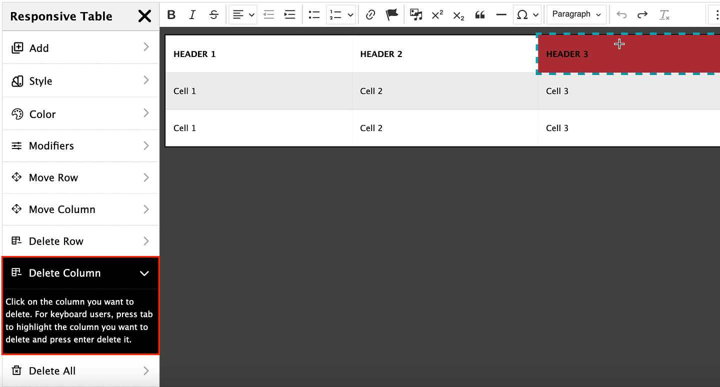
Delete Columns
To remove a table column, right click anywhere within the table and select the "Edit Responsive Table" option. This will bring up the sidebar menu. From the sidebar menu, select "Delete Column" and click on the column you want to delete. For keyboard users, press tab to highlight the column you want to delete and press enter delete it.
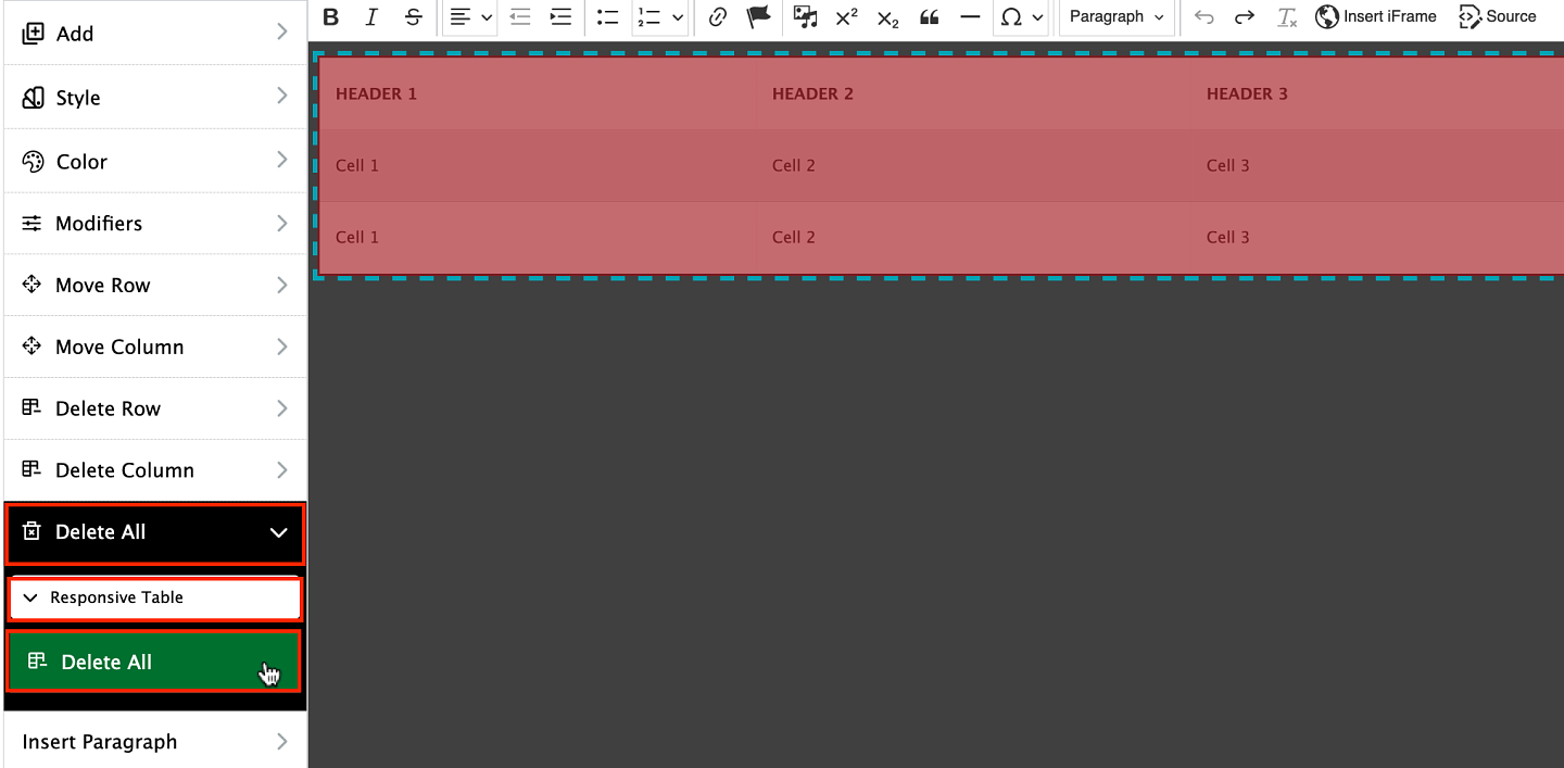
Delete Responsive Table
To remove the entire responsive table, right click anywhere within the table and select the "Edit Responsive Table" option. This will bring up the sidebar menu. From the sidebar menu, select "Delete All" then "Responsive Table." Click the "Delete All" button to completely remove the responsive table.
Advanced Table Styles
Tables using the default Responsive Table style can use some additional class modifiers to adjust the column width. This setting cannot be applied to Tables using the Data style as it could cause display issues on mobile or tablet views.
Using the Source Code view, individual column widths can be set to 25%, 50%, or 75% width in the class section of the code. To adjust the width, add into the class for the header item a w25, w50, or a w75 to the class section. You can also use it on individual table cell classes, although that may not be as effective as using the width style on the header row items. The final code will look like this 50% example:
<th class="table__cell table__header w50">Header 1</th>
An example of a table using the width modifier classes:
Header 1 w50 | Header 2 | Header 3 w25 | Header 4 | Header 5 |
|---|---|---|---|---|
Cell 1 This is a line of text showing how the cells will stack when placed inside of a responsive table using the 50% width class. | Cell 2 This is a line of text showing how the cells will stack when placed inside of a responsive table with no modifiers. | Cell 3 This is a line of text showing how the cells will stack when placed inside of a responsive table using the 25% class. | Cell 4 This is a line of text showing how the cells will stack when placed inside of a responsive table with no modifiers. | Cell 5 This is a line of text showing how the cells will stack when placed inside of a responsive table with no modifiers. |
Cell 6 | Cell 7 | Cell 8 | Cell 9 | Cell 10 |
Cell 11 | Cell 12 | Cell 13 | Cell 14 | Cell 15 |
Note: Occasionally, if you are using the responsive table styles, you may see display issues when setting specific widths on your tables and need to add an additional class to the first table <div> class, which will look something like: "table table--responsive w100". Also, use caution when adjusting your column widths and always preview your page since text heavy cells can become very squished in some views depending on which width settings you are using.
You may also find that you need a more streamlined table. In this case you may want to use something like a Responsive Card Table:
Text | Text |
Text | Text |
Text | Text |
Text | Text |
Text | Text |