What Are Other Universities Doing?
Something that can be useful in this process is comparing what you are doing and what you would like to do with what other universities are doing.
When choosing which websites to compare, consider Big Ten institutions, AAU institutions, and flagship universities, but don’t leave out smaller or private universities. It is always good to get a broad look at what others are doing.
Be aware, just because other websites are using specific language or terminology, or different organization or features, we don't necessarily want to copy them. We don't know how effective that terminology or feature is on their website without doing comparative testing with users.
So remember, just because other websites are doing it, doesn't automatically make it the best option for you or your audiences.
What To Look For
Some of the things that you should look for when looking at other schools are:
- Who is the primary audience? (Who are they trying to reach the most — students, faculty, staff, public)
- What information is being provided? (Content)
- How is information being provided? (Text, bullet points, photos, charts, checklists, forms, videos, infographics, etc.)
- How is their information organized/grouped together? (Task-based, audience-based, organizational structure-based, etc.)
- What terminology are they using? (What words are they using to describe tasks, etc.)
It is good to write down what you think about the websites you visit. You can include information about:
- Specific elements you like and dislike (toolbars, links, photos, organization, text, etc.)
- How a website makes you feel (friendly, inviting, dark, sad, etc.)
- How easy it is to navigate and find information
- Things you find confusing
- Forms or information you may find useful for your website
Once you have completed your comparative analysis, your team will need to determine what information and ideas will be valuable as you move forward in this process, including:
- Why you may like or dislike some websites
- What may or may not be working on your comparison websites
- What may or may not work on your website
Comparative Analysis Form (Excel)
Comparative Analysis Form Instructions
Overall Comparison Tab
In this section of the comparative analysis form, you can write about your overall observations of your comparison websites. It should include your notes about who you think the audience is, the look and feel, how the navigation is organized (task, audience, other), types of content, and overall impression.
Primary Navigation Tab
Primary Navigation Links
In this section of the comparative analysis form, you should write down the words used in the website's primary (top-level) navigation. You should write them for each comparison website starting with the navigation item on the far left in the Link 1 column, and moving from left to right.
This information helps you understand what others think is the most important information on the website, how they organize their content into large groups, and the language that is being used. It will be used when developing the information architecture for your new website.
Example:
In this example you can see how to take the five primary navigation terms from the University of Oregon website — Academics, Research, Admissions & Financial Aid, Duck Life, and About — and add them to the spreadsheet from link 1 (Academics) to Link 5 (About). In addition, you can see the primary navigation from the University of Washington, Oregon State University, and the University of Colorado.
Primary Navigation Elements
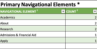
In this section of the comparative analysis form, you should write down the words used in the website's primary (top-level) navigation and note how often that language is used.
You should list the names of the links from the primary navigation section in the navigational element column and mark how many times you see these links across different universities' top-level navigation.
This information helps you understand the common sections and language used on comparison websites. It will be used when developing the information architecture for your new website.
Example:
You can see from the example how Academics, Research, and About are common navigation elements from all four websites, while the remaining navigation elements are only present on one of the four websites.
Audience Tab
Audience Links
In this section of the comparative analysis form, you should write down any audiences that may be listed on your comparison websites. These audiences may not be part of the primary or secondary navigation.
This information helps you understand if there is specific information for specific audiences and how those audiences are broken out.
Example:
In this example you can see how to take the four audience terms from the University of Oregon website — Student One Stop, Parents, Faculty/Staff, and Alumni — and add them to the spreadsheet from link 1 (Student One Stop) to Link 4 (Alumni). In addition, you can see the audiences from the University of Washington, Oregon State University, and the University of Colorado.
Audience Elements
In this section of the comparative analysis form, you should write down the words used for the website's audiences and how often that language is used.
You should list the names of the audience links from the audience section in the navigational element column and mark how many times you see these links across different universities' audience navigation.
This information helps you understand what audience the website is trying to reach. It will be used when developing the information architecture for your new website.
Example:
You can see from the example how Parents, Faculty/Staff, and Alumni are common audience elements from three of the four websites, while the remaining audience elements are only present on 1-2 of the four websites.
Departmental Navigation Tab
Departmental Navigation Links
In this section of the comparative analysis form, you should write down the words used if the website had any departmental navigation. This is most commonly seen on school or college websites that have department- or program- or major-specific sections. You should write them for each comparison website starting with the navigation item on the far left or top in the Link 1 column, and moving from left to right or top to bottom.
This information helps you understand how others are breaking out sections of their content. It will be used when developing the information architecture for your new website.
Example:
In this example, you can see how to take the departmental navigation terms from the Department of the History of Art and Architecture (part of the College of Design website) and add them to the spreadsheet from link 1 (Apply) to Link 11 (Contact Us). In addition, you can see the navigation from the Advertising concentration (part of the School of Journalism and Communication website) and the Special Education program (part of the College of Education website).
Departmental Navigation Elements
In this section of the comparative analysis form, you should write down the words used in the website's departmental navigation and how often that language is used.
You should list the names of the links from the departmental navigation section in the navigational element column and mark how many times you see these links across different universities' departmental navigation.
This information helps you understand the common sections and language used on comparison websites. It will be used when developing the information architecture for your new website.
Example:
You can see from the example how Apply, Courses, and Faculty and Staff are common navigation elements from all three websites, while the remaining navigation elements are only present on 1-2 of the three websites.
Footer Links Tab
Footer Links
In this section of the comparative analysis form, you should write down the words used in the website's footer. There may be many links in the footer, so focus on the types of links that are there as well as the overall list.
Example:
In this example, you can see how to take the departmental navigation terms from the Department of the History of Art and Architecture (part of the College of Design website) and add them to the spreadsheet from link 1 (Apply) to Link 11 (Contact Us). In addition, you can see the navigation from the Advertising concentration (part of the School of Journalism and Communication website) and the Special Education program (part of the College of Education website).
Footer Link Elements
In this section of the comparative analysis form, you should write down the words used in the website's footer links and how often that language is used.
You should list the names of the links from the footer links section in the footer element column and mark how many times you see these links across different universities' footer links.
Example:
You can see from the example how Accessibility is a common footer element from all three websites, while the address, Contact, Social Media, and Campus Safety are only present on two of the three websites.
Common Features Tab
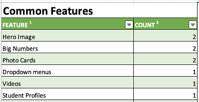
In this section of the comparative analysis form, you should write down the types of common features used on websites. This is where some of the design and content elements are presented.
This information helps to inform the types of content other websites are using and if there are some key features you want to include on your new website.
Some common examples of features include:
- Dropdown Menus
- Slideshows
- Hero Images
- Videos
- Photo Galleries
- Multimedia
- Bulleted Lists
- Charts and Infographics
- Checklists
- Student Profiles
- Alumni Profiles
- Sidebars
- Side Navigation
Homepage Content
In this section of the comparative analysis form, you should write down the type of content found on the comparison website's homepage. This is where some of the design and content elements are presented.
This information helps to inform the types of content you might want to include on the homepage or marketing pages of your new website.
Some common examples of features include:
- Slideshows
- Hero Images
- Videos
- Photo Galleries
- Multimedia
- Bulleted Lists
- Charts and Infographics
- Student Profiles
- Alumni Profiles