While your site map reflects your site’s organizational structure, wireframes reflect page-level structure. Think of wireframes as architectural blueprints. No color, images, or special fonts.
Wireframes communicate how content blocks should be organized on a page to support your end users’, and your department’s, goals.
What Informs Your Wireframes
You've done a lot of work so far to understand your audience and stakeholder needs and gather and write content. Before you begin wireframing pages, it's best to review the following:
Content Audit
Review your content audit to identify page types and their overall purpose. Ensure similar page types follow a consistent layout to provide continuity and meet user expectations.
User Research and Personas
Revisit your audience personas to understand the primary target audience, user goals, and keywords. Use this information to design wireframes that support user tasks and create an engaging, intuitive experience.
Stakeholder Insights
Consider the feedback from stakeholder interviews, including business objectives, calls to action, and measurable outcomes. Wireframes should visually prioritize content to guide users toward key actions or messages.
Create Wireframes
Wireframes and sketches are great tools for gathering user feedback at any stage in the design process. Brainstorming ideas? Sketch them out and see what people think. Want to test your pages to make sure users can find what they need? Create a wireframe and give them some tasks. Validating page elements with stakeholders? Start with a wireframe.
There are three types of wireframe tests we recommend. While you may not test all stages of your wireframes, we strongly recommend that test your site with end users before going live.
Low Fidelity Wireframe
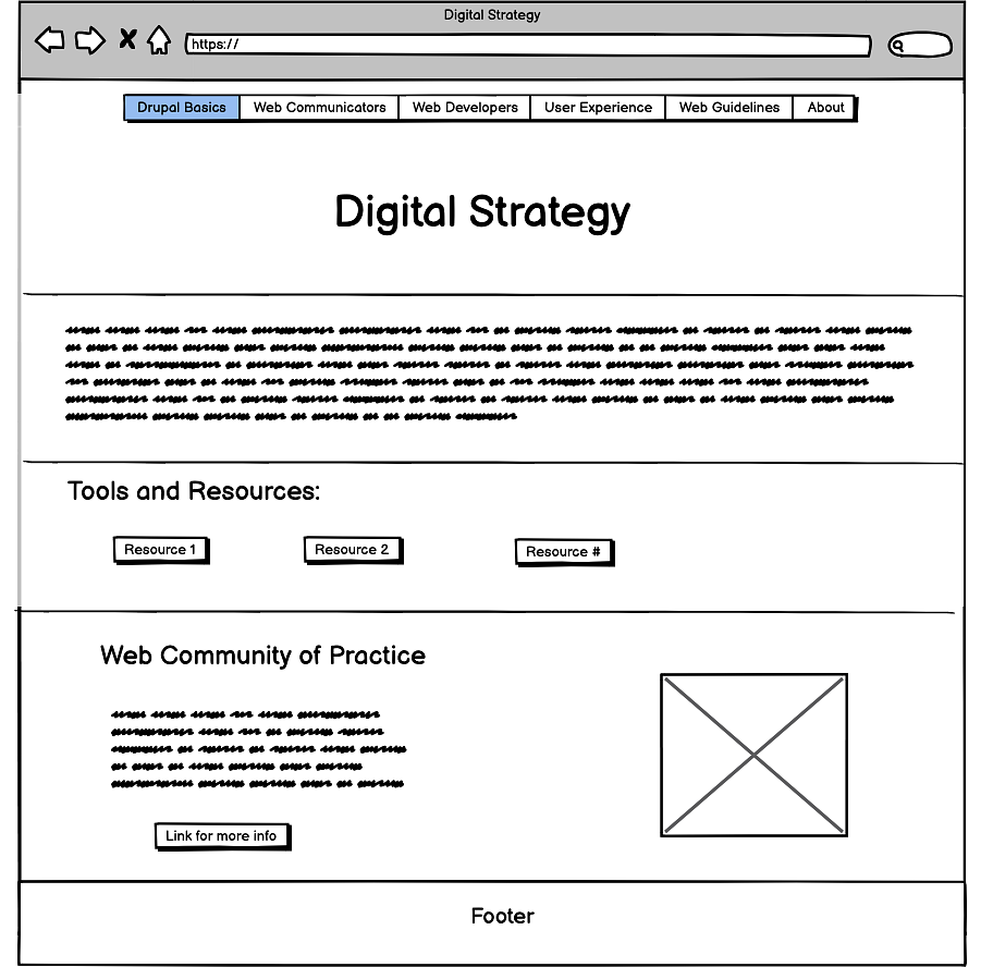
A low-fidelity wireframe shows the simple page structure but doesn’t include a lot of content details. A low-fidelity wireframe will be tested early in the design process, often using paper prototypes to gather feedback. When testing a low-fidelity wireframe, be sure to ask users about their expectations, behaviors, likes, and dislikes.

This wireframe represents the placement of the main text, visual, and button elements of the digital strategy homepage without color or design.
Medium Fidelity Wireframe
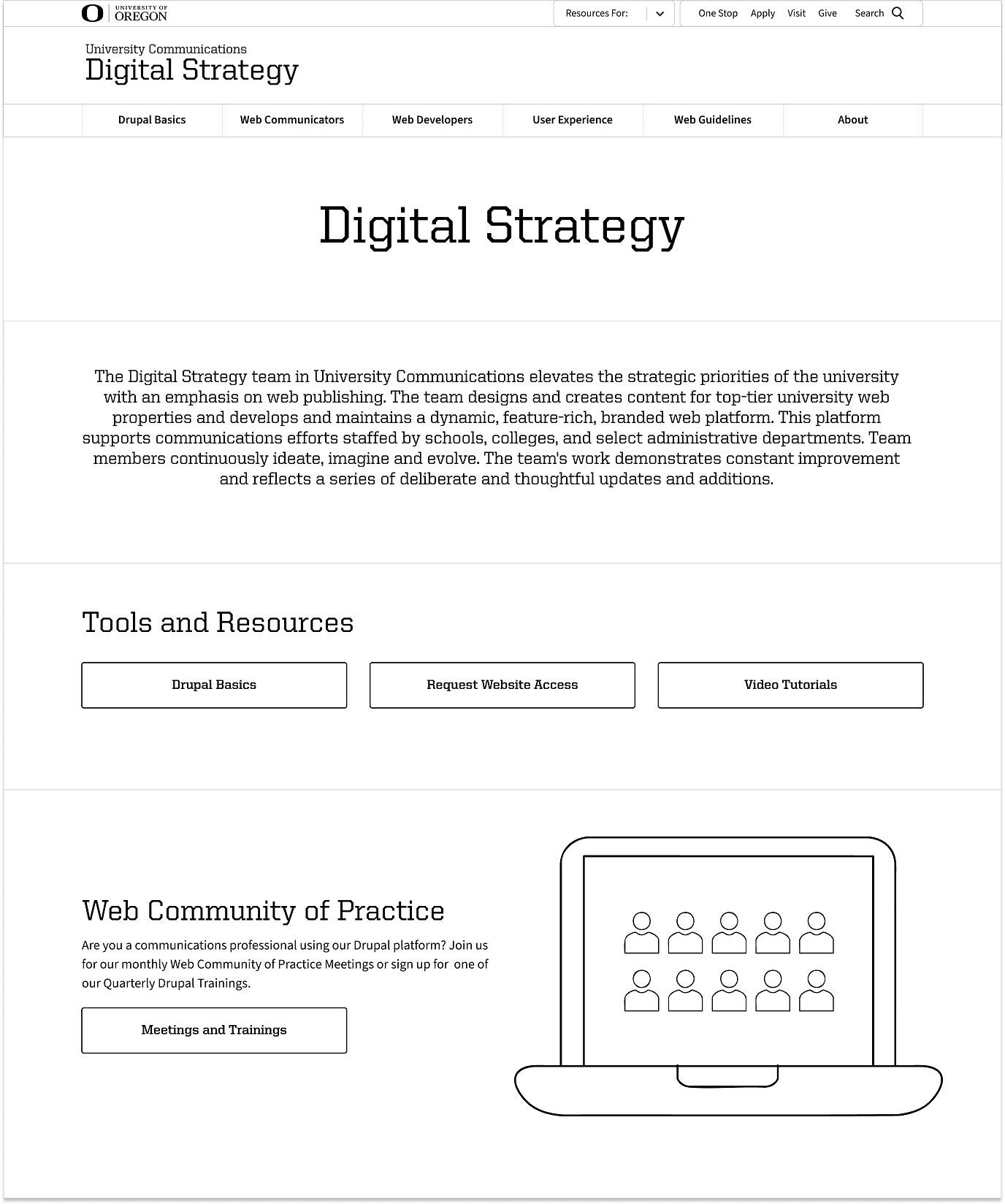
Medium-fidelity wireframes include more content details, but still no color or design. Often, your medium-fidelity wireframes are presented as interactive PDFs or HTML prototypes, allowing you to test task flows and more complex interactions. While you still may ask questions during user tests, you really want to sit back and watch what people do.

The medium fidelity wireframe provides button labels and text alongside graphics to provide a sense of the content without design.
Note: Always ensure that your wireframe PDFs are accessible.
High Fidelity Prototype
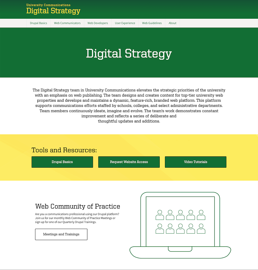
For more complex sites, you might want to test a high-fidelity prototype. A high-fidelity prototype is the closest thing to your final site in terms of design and functionality. You’ll most likely test with a high-fidelity prototype near the end of the design phase to be sure that you have worked out all the kinks before your site goes live.

The high fidelity wireframe shows the digital strategy website with color, images, and designed page elements as it will look once live.
