Adding Headers
About Headers
Think of headers as the outline of your page. For accessibility reasons, they must be arranged to show the hierarchical ordering of information from the broadest (Heading 2) to secondary information that supports the information in each Heading 2 (Heading 3) to the most specific information that supports the information in each Heading 3 (Heading 4).
Do not skip levels. Do not begin with a Header 3 or jump directly from a Header 2 to a Header 4. You can return to a Header 2 from a Header 3 or Header 4 when transitioning to a new broad topic.
As a general rule, we recommend that you do not apply bold or italics to your headers as they already have a bold style applied to them and the italics should only be used in specific use cases.
Accessibility
For screen reader users, header tags are vital in giving a sense of the main topics of the page and enabling easier navigation through your content. Think of your headers as a table of contents for your page for both screen reader software and your users. Additionally, effective header tags help search engines understand your web content so that users can be guided to your website.
Examples of Header Formats:
Header 2
Header 3
Header 4
Header 5
Header 6
Example of How to Use the Header Formats:
United States (Header 2)
This information is about the United States. Lorem ipsum dolor sit amet, cu solet vocent similique sea, sale iusto utroque an mel. Sed doctus iisque ceteros ei, iracundia aliquando eos id. Corpora conclusionemque at eos, usu elitr debitis in.
Oregon (Header 3)
This information is about the state of Oregon in the United States. Lorem ipsum dolor sit amet, cu solet vocent similique sea, sale iusto utroque an mel. Sed doctus iisque ceteros ei, iracundia aliquando eos id. Corpora conclusionemque at eos, usu elitr debitis in.
Eugene (Header 4)
This information is about the city of Eugene in the state of Oregon in the United States. Lorem ipsum dolor sit amet, cu solet vocent similique sea, sale iusto utroque an mel. Sed doctus iisque ceteros ei, iracundia aliquando eos id. Corpora conclusionemque at eos, usu elitr debitis in.
How to Add Headers
To style headers for your body copy, highlight the text you want to format and click on the button that says “Normal” on the toolbar. That will give you a drop-down menu. Scroll down and select from Heading 2 or Heading 3 or Header 4.
Be sure to use “header” tags (H2 for major headings, H3 for subheadings, H4 for sub-subheadings) to separate sections rather than just bolding the text.

Adjusting Header Sizes
These text size classes can be useful when you need headers to be visually larger or smaller, without changing the HTML header tags that wrap the element.
uo-text-size--xs
uo-text-size--sm
uo-text-size--rg
uo-text-size--md
uo-text-size--lg
uo-text-size--xl
uo-text-size--2xl
uo-text-size--3xl
uo-text-size--4xl
uo-text-size--5xl
How to Change Header Size
To apply one of the above text classes to a heading, go into the source code and add the class to the end of the opening heading tag. For example:
<h2 class="uo-text-size--rg">Meet Our Team<h2>
The above code will look like this:
Meet Our Team
Learn more about applying text size classes here.
Adding Text Above or Below a Grid or Other Non-Standard Item
When working around your grids or other template items you may need to add text above or below that item. As an example, when there are two grids or templates adjacent to each other and you want to add a horizontal line between them.
To add a new text paragraph above or below your grid or other template item, you will need to use the “insert paragraph” option shown here as a red line and red box with a left curved arrow:
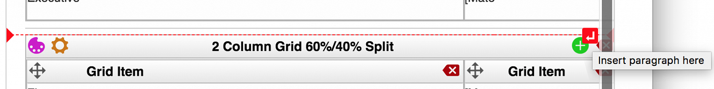
To add spacing between two grids or template items when editing your content, click near where you want to add the new paragraph space and place your mouse cursor above or below the grey box where you want the extra space added and the red line and a red box with a white arrow will appear:
Click on the red box with the arrow and it will add a new paragraph space where the red line is shown.
Special Characters
You can use the Special Characters (Ω) button in the editor to add special characters (—, ©, ™, ¢, £, ≈, etc.). When you click on this button it will open a pop-up window with more than 100 different letters and characters you can insert into your content.
To insert a character, place your cursor where you want the new character, click the Special Characters button, then click on the character you want and it will be added to your content.
Typography in Cosmic
Do you want to customize the size or weight of a line of text on your website? Learn about the typography options available in our Drupal Cosmic theme:
List Classes and Styles
Lists have two basic styles, one with a round bullet, and one with numbers. These are called an "unordered list" (<ul>) and an "ordered list" (<ol>), respectively. Currently, we have one class which can be used to create a list with more advanced numbering, such as 1.1, 1.2 for the "ordered list" items.
List Class Name | Example Code |
|---|---|
list-style--nested-numbers | <ol class="list-style--nested-numbers"> |
To use these advanced numbering styles you will need to add the class to your list's <ol> tag in the Source view of your editor and use the "increase indent" button in Drupal the editor menu to increase the number depth.
To do this you will go to the Source code view and replace the basic ordered list tag:
<ol>
with the new class modifier and ordered list tag:
<ol class="list-style--nested-numbers">
You would then use the "increase indent" button to move your bullets to the right which will add additional #.## item depth:
If you are looking for roman numerals, we do not currently have a class for those, but you can add them to your <ol> tag manually by updating your <ol> tag from this:
<ol>
to this for uppercase roman numerals:
<ol style="list-style-type: upper-roman;">
(E.g., VII)
or this for lowercase roman numerals:
<ol style="list-style-type: lower-roman;">
(E.g., vii)
List Class and Style Examples
Nested class example, using the "increase indent" button to increase the number count for the list items:
List Class Name | Example |
|---|---|
<ol class="list-style--nested-numbers"> |
|
List Style | Example |
|---|---|
Uppercase: |
|
Lowercase: |
|