Building the framework for your website’s content
Understanding what your users want and expect plays a key role in determining how you design and organize the content and navigation on your website. Now that you’ve taken the time to understand how your users expect content to be organized and what terminology they use, you will create your website’s information architecture.
What is information architecture?
Information architecture (IA) is the structural design of a website, including the organization and labeling that helps users find content. Information architecture focuses on your users, how they navigate through your site, what technology they use, and what content you provide.
The first step in creating an information architecture it so analyze the requirements data you collected from end users and stakeholders around the primary tasks and terminology they expect the site to support. From there you will divide your content into categories and sub-categories, establishing a content hierarchy that will support user goals and create intuitive navigation paths. Card sorts are a great way to understand how users expect content to be organized and tree test allow you to test out the IA you create.
Once you have your categories and sub-categories established, an information architecture site map (website structure) and wireframe (design blueprint) will document and communicate this structure and provide a framework for organizing your content.
What is an information architecture site map?
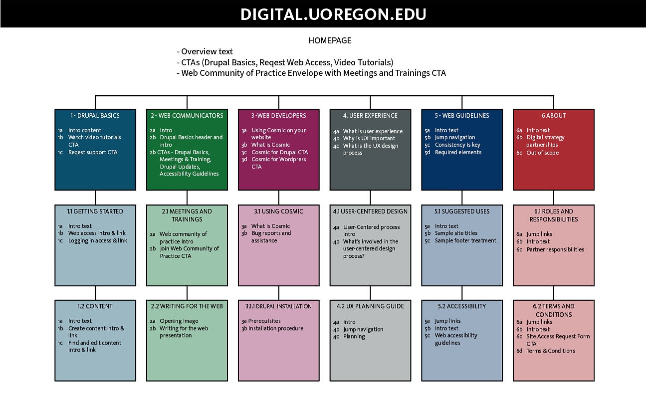
An IA site map is a planning tool that visually shows how information will be organized and labeled, where content will be located, and how a user will move through your website. It lists the pages and content organized in a hierarchical fashion that should be read from top down, from left to right.

Each square in this site map represents a page on the digital strategy website. The main site sections are numbered 1.0-6.0 with their corresponding sub-pages beneath. Text inside each square represents the content that you would see on the given page.
Primary Site Navigation
List the primary navigation (the main menu listed horizontally across the top of the site just below your department’s name) below the homepage information in your site map.
The primary navigation is the starting point of your user's journey through your website. It is located at the top of every page and is consistent throughout the website.
The primary navigation should represent 5-8 sections of content that users are most interested in visiting. It will be read from left to right, so prioritize your tasks starting with the most important / most used tasks on the left.
Below is an example showing a site map for primary navigation and the resulting navigation as displayed on the final site.

Squares 1-6 represent the main landing pages on the digital strategy website. The text within each square represents the content you would find on that page.

Secondary Site Navigation
Content that supports or is secondary to your site's primary goals should go into the secondary navigation.
Each of the secondary navigation elements is a separate webpage that the user lands on when they click on the secondary navigation link. On the site map, these boxes will located under the primary navigation boxes.
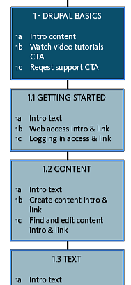
Drupal Basics Page Site Map Reflecting Secondary Navigation:

The pages that are nested with section 1.0 (Drupal basics) are represented as additional squares (1.1, 1.2, 1.3, etc.) Each square show the content which will live on the page.
