
Responsive Design
What is Responsive Design?
Responsive design is an approach to web design in which web pages automatically adjust to the screen size of the device used by each site visitor.
Rather than having to create and maintain a separate "mobile" website, our sites use flexible templates that “respond to” or resize depending on the type of device, screen size, and screen orientation each site visitor is using. From a widescreen desktop monitor to a 4-inch smartphone screen, our sites are designed to work well on every device.
Benefits of Responsive Design
Positive user experience:
More than half of all web traffic comes from mobile devices with a variety of screen sizes. Responsive design ensures that websites function well at any size without any special action required on the part of site visitors. With responsive design, people are less likely to quickly bounce out of your site and more likely to visit your site again.
Improved search engine rankings:
Google includes mobile-friendliness in site rankings. Sites that are mobile friendly get a boost in search engine rankings.
Time and resource savings:
Responsive websites save time and effort on the part of site editors and web developers since there is no need to build and maintain separate page layouts for different devices.
The components we provide through the Drupal Cosmic theme are highly customizable. We are always expanding and updating these components, so if you have suggestions for new features or changes to existing components, we want to know. Just email us about it and we will try to meet your need with a solution that works for everyone.
Suggest a Design Component or Template Ticket
Current Brand Standards
Our UO Drupal sites use the same fonts and colors as listed on the UO Brand's web standards page. The UO is currently in the process of rolling out new and updated brand standards, as announced in mid-2026. These updated standards will be available on the UO Brand's Visual Identity page once the updated brand standards are ready for distribution. Once that happens, the current Drupal sites will be automatically updated as the brand updates are rolled out to our sites.
Note: If you, or someone in your unit, are wanting to update your website with the new branding assets prior to 2027, as a heads up, these will not be available until early 2027 and we appreciate your patience.
Fonts on the Web
Our web fonts include three key typefaces: United Sans Regular, United Serif Regular (both are used for headlines), and Source Sans Variable (for body text).
University Communications has a license for all .uoregon.edu domains it supports and the font is included in the official UO Drupal Cosmic theme. If you are unable to use this theme or license, we suggest using Source Sans as a replacement font.
It is a web design best practice to limit your website’s typography to 2–3 fonts at most. Here are a few reasons why:
Consistent typography helps usability:
Using the same fonts for elements that serve the same function helps users easily identify those elements and understand what they mean. Using one font for all body copy and one font for all headers helps create consistent visual structure, which makes scanning the page for information much easier.
Using too many fonts leads to confusion:
Using a variety of fonts, on the same website or over multiple related websites, decreases usability because site visitors have to work harder to understand what each font represents. UO websites should be limited to our two official web fonts—United and Open Sans.
Limiting fonts increases website speed:
All of our websites share the same code base and functionality. Adding a single font to one website would mean adding it to all of our websites. The more fonts we use, the more fonts we have to provide every user. That increases the time it takes to load a page, which is especially impactful on mobile devices.
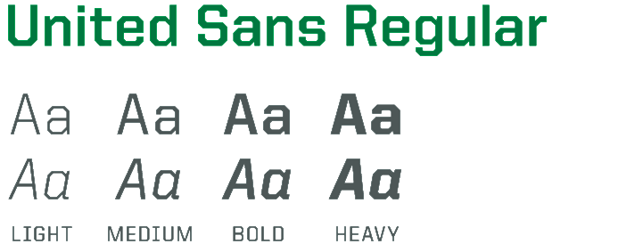
Use for headings, subheadings, and header and footer text.
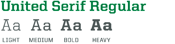
Use for headings, subheadings, and header and footer text
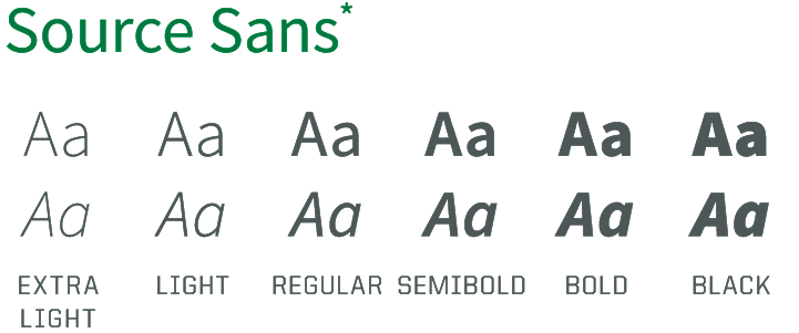
Use for body copy and when United is not available.
* In print, use primarily for business correspondence when United is not available
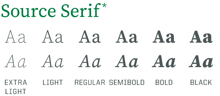
* In print, use primarily for business correspondence when United is not available.
Note: The University of Oregon has licensed United for limited use on the web. It is not licensed for use across all UO websites. For more information about using United on your website, please contact uobrand@uoregon.edu.
Color on the Web
Learn how and when to use color to create a web experience that's both effective and aligned with the UO brand: