Using color appropriately is one of the easiest ways to ensure your communications reflect a cohesive UO brand.
Green and yellow are your go-to colors. Choose from our secondary palette when you want to enhance or support the primary colors. It’s usually best to stick with just one supporting shade.
Don’t forget to build white space into your design. Like the pauses in music, white space builds visual breathing room into your design and can help focus attention on what’s important. Always balance color, typography, and graphic elements with plenty of white space.
On the web, ensure you provide sufficient color contrast for text and graphics.
Primary Brand Colors
The University of Oregon's institutional colors are green and yellow. These colors should always figure dominantly in your design work.
HEX: #007030 | CLASS: palette-bg-uo-green
HEX: #FEE11A | CLASS: palette-bg-uo-yellow
Secondary Brand Colors
We developed our secondary color palette to complement our primary colors, drawing hues from our natural environment.
Use these colors sparingly, occasionally, and always in a supporting role to our green and yellow. Never make any of these shades the predominant color for a school, center, institute, or department.
When bringing in secondary colors, take extra care not to create designs that don’t reflect the University of Oregon brand—or worse, that appear to represent another institution.
HEX: #104735| CLASS: palette-bg-uo-legacy-green
HEX: #004F6E| CLASS: palette-bg-dark-blue
HEX: #489D46| CLASS: palette-bg-grass-green
HEX: #00A5B5 | CLASS: palette-bg-light-blue
HEX: #8ABB40 | CLASS: palette-bg-lime-green
HEX: #4D5859 | CLASS: palette-bg-dark-gray
HEX: #E2E11B| CLASS: palette-bg-chartreuse
HEX: #A2AAAD | CLASS: palette-bg-medium-gray
HEX: #8D1D58 | CLASS: palette-bg-berry
HEX: #D8DcDA | CLASS: palette-bg-light-gray
Colored Text on Websites
It is considered best practice to limit the use of colored text on websites. Here are some of the reasons why:
Use colored text consistently:
For example, if links are green, site visitors are likely to assume that all green text is clickable. To provide the best user experience, a text color should be chosen for a specific purpose and used consistently across the site.
Use colored text sparingly:
When everything is emphasized, nothing is emphasized. Using color strategically makes colored items stand out more. For example, green, underlined links attract attention when they are surrounded by the typical text color used for paragraphs and headings.
Color is not accessible for all users:
Many of these people are unable to distinguish between red and green. Since we use green on UO websites to indicate links, using red to show importance may cause some users to mistake the red text for a link. Read more about accessible use of color on the web below.
Accessible Use of Color on the Web
Around 300 million people worldwide are unable to perceive some color differences.
Using color as the sole indicator makes the content inaccessible to some users. For that reason, color cannot be the only indicator of importance or functionality.
Always use the HEX color values listed here to ensure they meet accessibility standards and provide sufficient color contrast for text and graphics. To help meet accessibility guidelines, some of our web color values have been altered slightly from print color values.
Color Guidelines for Digital Accessibility
Do's and Don'ts of Color Use
- Use our primary green and yellow dominantly in all communications.
- Use accessible color combinations that offer sufficient contrast for all audiences.
- Include plenty of white space.
- Use the color builds provided in this guide.
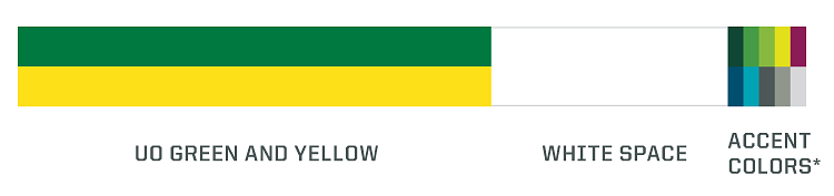
- Refer to the ratio below when using color in your designs. It’s not an exact science—UO green and yellow don’t have to be in equal proportion. Accent colors are entirely optional—but can help you keep your designs balanced.
- Don't change the colors of our protected brand marks, including logos and the mascot mark.
- Don't make secondary colors prominent in your designs.
- Don't use color as the only indicator of importance or functionality on the web. Not everyone sees color the same way. Call out important information by adding an additional visual cue (icon, underline, etc.).
- Don't use color combinations that are not accessible or are hard to read, such as white text on a yellow background.
- Don't use color combinations that appear to represent other institutions.
- Don't alter the color builds provided in this guide, or rely on software programs to convert colors from one format to another.