Cards are blocks of data that contain a photo, a title, a subhead, and a teaser. Those items can be reordered or deleted to fit your needs. They are vertical items that can be made into a horizontal list.
Getting Started Tip
Although not required, cards are typically used in grids. Add the grid first, then add the cards in each grid item. If you have a full-width page (no left-hand secondary menu), you should probably use a 3- or 4-column grid. If you have a left-hand secondary menu, you should probably use a 2- or 3-column grid.
Add Cards
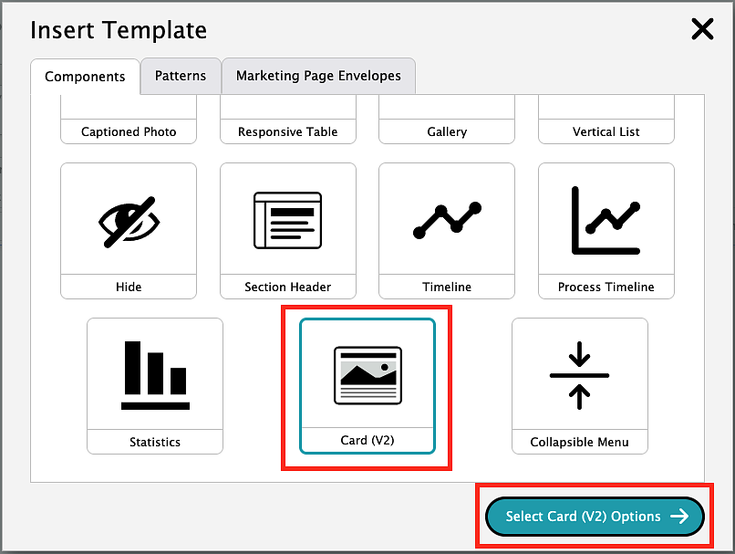
To create a card, you will need to click on the template icon in the editor toolbar.
Choose the second option labeled "Card (V2)" then click the "Select Card (V2) Options" button.
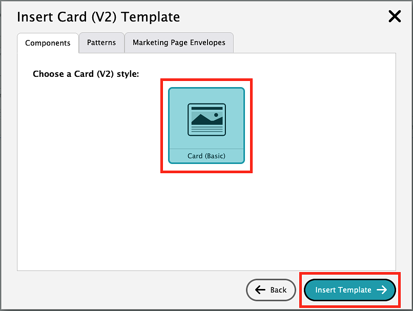
On the Insert Card (V2) Template, select "Card (Basic)" then click the "Insert Template" button. This will add a card to your page.
You can now type your text for the card title, subtitle, body copy, and call to action button.
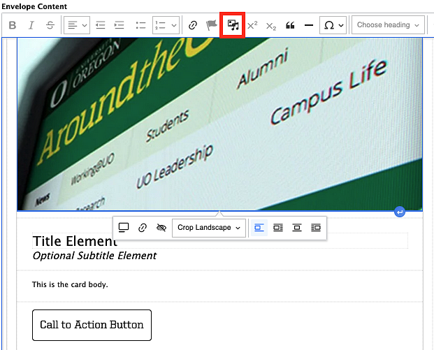
To add your photo, click on the placeholder image then select the add image icon in the WYSIWYG editor. That icon will bring up the media browser popup box that you see when you add new images and will function exactly the same, except you are replacing the existing placeholder image with a new one. Follow the same steps as adding a new image and the old image will be replaced by a new one.
Note: These examples show a card that is added to the left side of a two-column grid.
Add Card Items
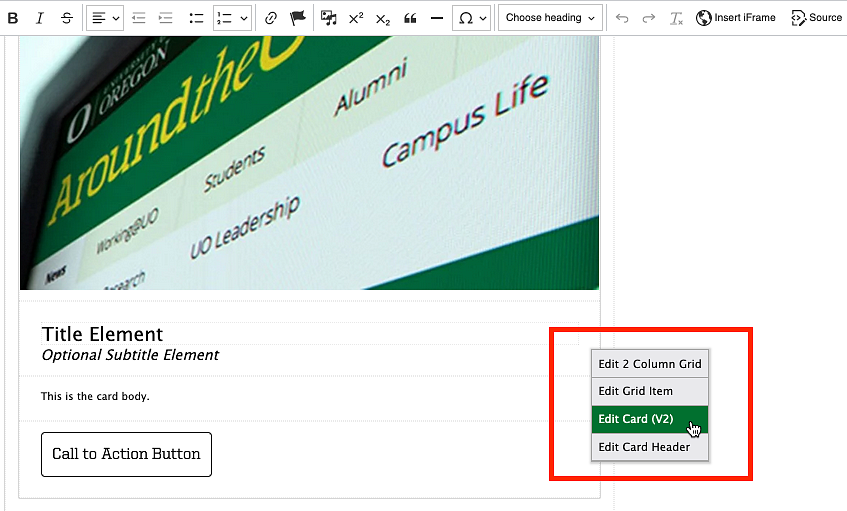
To add additional components to a card, right click in the card box and select "Edit Card (V2)" to bring up the sidebar menu.
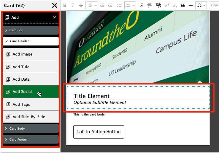
From the sidebar menu, select the "Add" option. If you expand the different card sections ("Card Header", "Card Body", and "Card Footer") you will see different components you can add to those sections. The section you are adding to will be outlined in a blue dash in the editor window. Click any of the components to add to that specific section of the card.
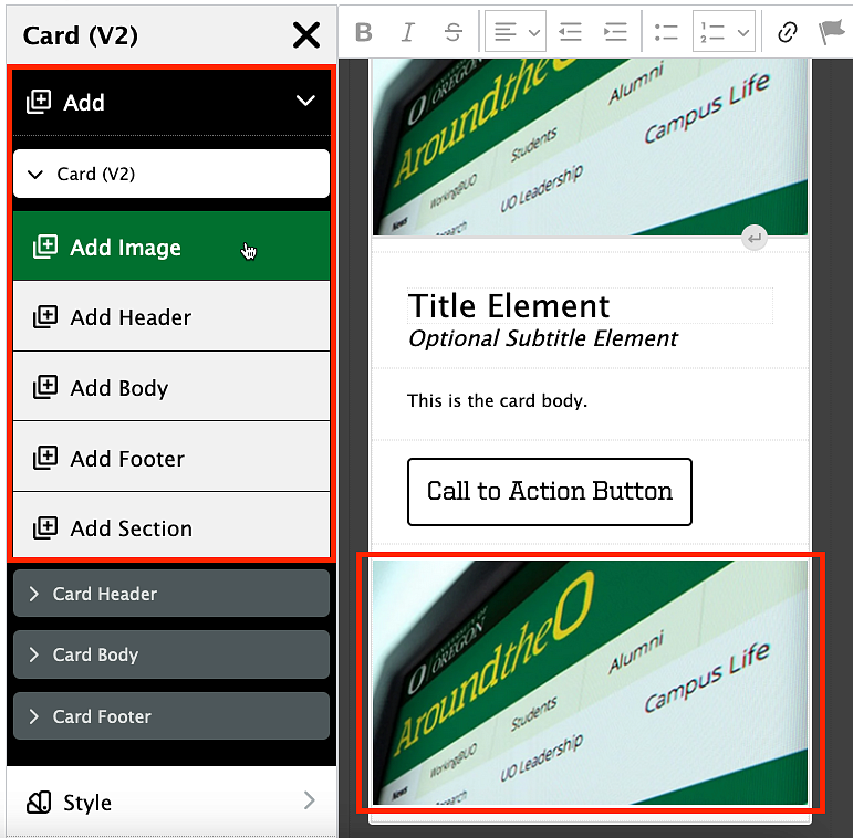
To add new components below the current card components on the page, select "Card (V2)" under the "Add" section of the sidebar menu.
Card Modifiers
Inset Image
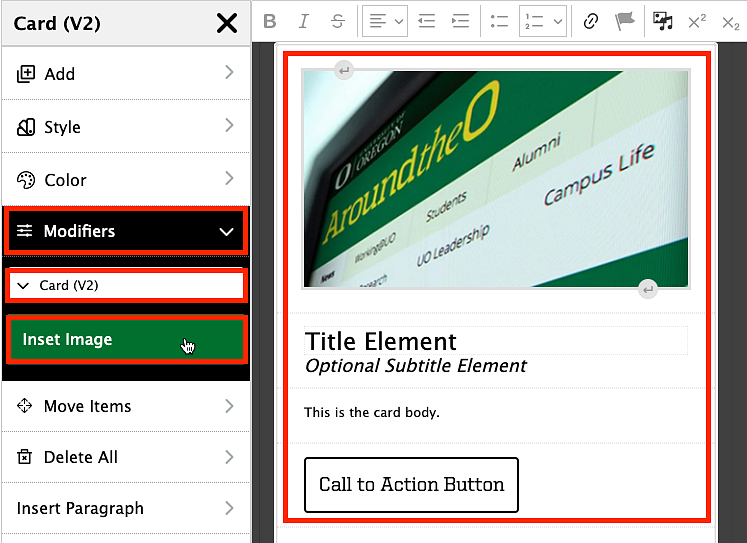
Cards are automatically defaulted to have the image left aligned to the edge of the card. You can modify this to make the image align with the text below it by selecting "Modifiers" then "Card (V2)" from the sidebar menu. From here, click the "Inset Image" button and you will see that the image now aligns with the text below it.
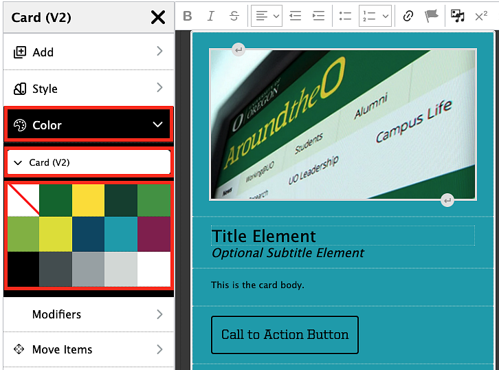
Card Backgrounds
Cards are automatically defaulted to have no background color. You can add background colors in the sidebar editor by selecting "Color" then "Card (V2)". Click on a color in the swatch to change the color of your card background.
Card Borders
Cards are automatically defaulted to have a thin border around the entire card template. You can add an additional border class in the source code to other card template items by clicking the "Source" button in the Drupal content editor menu, searching for your card's text in the source code view, and then updating the class text from the default text to add the card-borders class text. For the default "card-v2" class this would be something like:
class="card-v2 card--borders
The class="" text will be followed by the "es-" text in the source code view and adding the "card-borders" text to the card's class text will make your template item have a thin border.
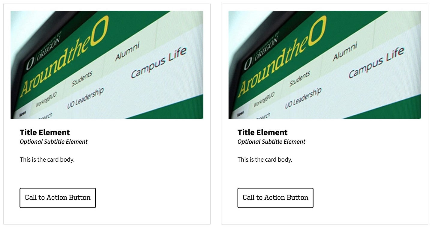
You may want to give your border a specific color. In this case, you would want to use the class text:
palette-accent-uo-green
This class text would be used instead of the "card--borders" class text. The palette class text can be combined with other CSS classes, like padding, different UO colors, or border thickness, and can also be used on your grid items. The final class text could result in something such as:
b3 mt3 p1 palette-accent-uo-yellow
You may also want to remove the borders. In this case you would use the class text:
b0
The "b0" class text will set the border of that item to be 0 thickness, hiding it from view.

Your final code could result in something like the below examples:
<div class="grid grid--2col grid--strict">
<div class="grid__item">
<div class="card-v2 b3 mt3 card—borders">
<div class="card-v2__image">
<drupal-media class="crop_landscape" data-entity-type="media" data-entity-uuid="0507274b-978d-42f3-8212-2961a096b172" data-view-mode="crop_landscape"> </drupal-media>
</div>
<div class="card-v2__header">
<div class="card-v2__title">
Title Element
</div>
<div class="card-v2__subtitle">
Optional Subtitle Element
</div>
</div>
<div class="card-v2__body">
This is the card body.
</div>
<div class="card-v2__footer">
<a class="cta-button">Call to Action Button</a>
</div>
</div>
</div>
<div class="grid__item b3 pt2 pr2 pb3 pl2 palette-accent-uo-green ">
<div class="card-v2 b3 palette-accent-uo-yellow">
<div class="card-v2__image">
<drupal-media class="crop_landscape" data-entity-type="media" data-entity-uuid="0507274b-978d-42f3-8212-2961a096b172" data-view-mode="crop_landscape"> </drupal-media>
</div>
<div class="card-v2__header">
<div class="card-v2__title">
Title Element
</div>
<div class="card-v2__subtitle">
Optional Subtitle Element
</div>
</div>
<div class="card-v2__body">
This is the card body.
</div>
<div class="card-v2__footer">
<a class="cta-button">Call to Action Button</a>
</div>
</div>
</div>
</div>
NOTE: The "es-" modifiers have all been removed from the above code example as it could cause issues if copied into your code if there are any conflicts with your content. Your code should update when previewed or saved to add the es- relevant code.
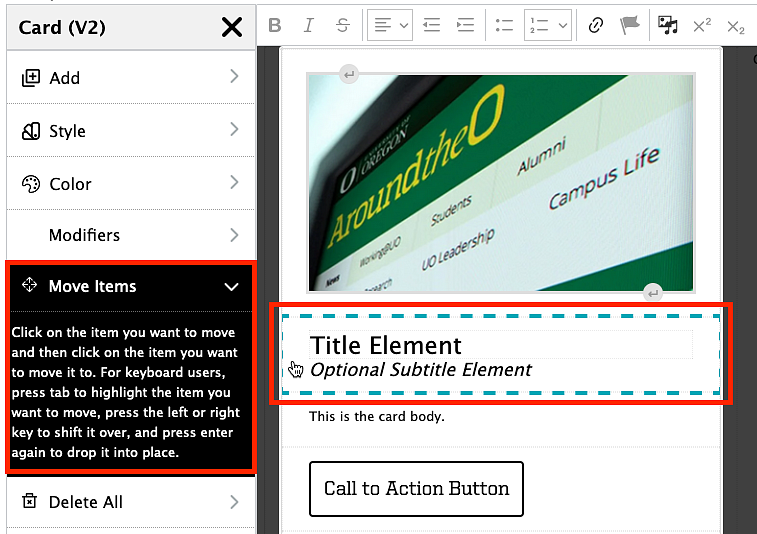
Rearrange Card Items
To rearrange card items, right click in the card area and select the "Edit Card (V2)" option to open the sidebar menu. From the sidebar menu, select the "Move Items" option. Click on the item you want to move (it will be outlined in a blue dotted line) and then click in the area you want to move it to. For keyboard users, press tab to highlight the item you want to move, press the left or right key to shift it over, and press enter again to drop it into place.
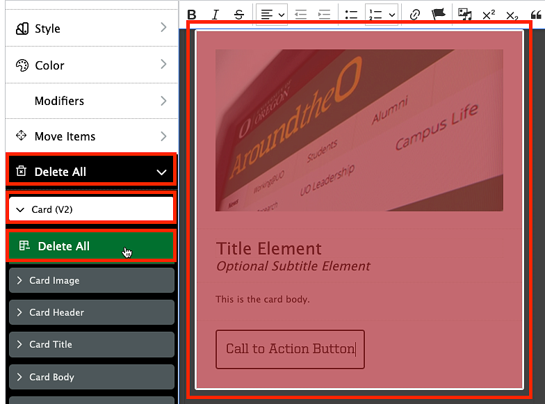
Delete Cards
To remove the entire card, right click in the card area and select the "Edit Card (V2)" option to open the sidebar menu. From the sidebar menu, select the "Delete All" option. Click "Card (V2)" then "Delete All" to delete the entire card.