Grids are column elements automatically scale to accommodate all screen sizes, including tablets and mobile phones.
When viewed on a mobile phone, grid items will stack on top of each other—the grid item on the right will drop below the grid item on the left. If you have more than two grid items they will continue to stack on each other in a zipper style layout.
Grids should not be used for table data (information that requires a header to be understandable). Table data that needs to retain a row/column structure with headings should use the responsive table template.
Adding Grids
To add a grid to your content, click on the location where you want to insert the grid.
Click the UO Edit Suite Templates icon. (Visit the Drupal Content Editor page to learn more about the options available in the editor toolbar pictured below.)
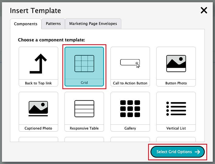
This will bring up the Insert Template pop-up window. To insert a grid, click the Grid option, then click the Select Grid Options button.
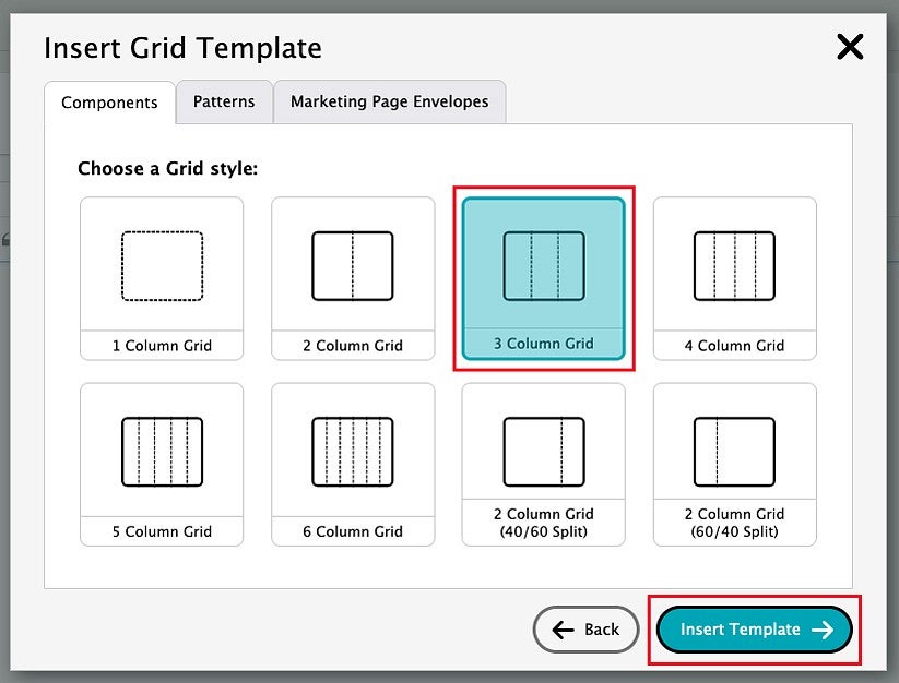
Click on the grid style that you would like to use. Grids are available in one- to six-column styles. A maximum of three columns is recommended for narrow pages with a sidebar navigation.
A 2 Column Grid will have columns of equal widths by default. You can also select a 40/60 or 60/40 split for 2 Column Grids.
After selecting your preferred grid style, click on the Insert Template button. You can edit the grid style later if needed.
Editing Grids
To add content to your grid, highlight the placeholder text that appears in each grid item (for example, "Grid Item 1") in order to overwrite it.
You can type text, copy and paste, insert an image using the Insert Media button, or insert a template using the UO Edit Suite Templates button.
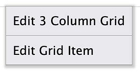
You can edit the grid in a variety of ways by right-clicking inside a grid item.
- To edit all grid items, select the top option, labeled "Edit (#) Column Grid" (Edit 2 Column Grid, Edit 3 Column Grid, etc.).
- To edit only one specific grid item, select the bottom option, "Edit Grid Item".
Begin Editing All Grid Items
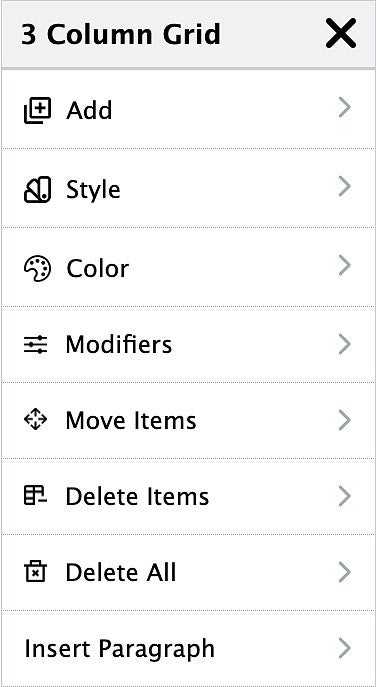
When you select the "Edit (#) Column Grid" option, a grid editing menu opens on the left side of the page, providing the following options:
This is a screenshot of the editing menu for a 3 column grid:
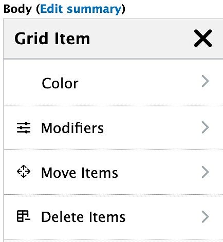
Begin Editing One Specific Grid Item
Right-click and select the "Edit Grid Item" option. The "Grid Item" editing menu opens on the left side of the page, which includes the following options: Color, Modifiers, Move Items, and Delete Items.
Closing the Grid Editing Menu
Each time you are finished making a change to a grid, close the grid menu by clicking the X in the top right corner of the menu.
This will close the grid editing menu on the left side of the page and you will return to the usual page editing mode.
Your changes are not saved until you click the Save button at the bottom of the page.
Grid Editing Options
Add
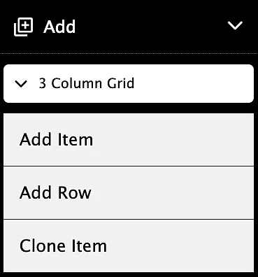
Click the "Add" option in the grid editing menu. A basic grid will include the following options:
- Add Item: Adds one grid item to the grid after the existing grid items.
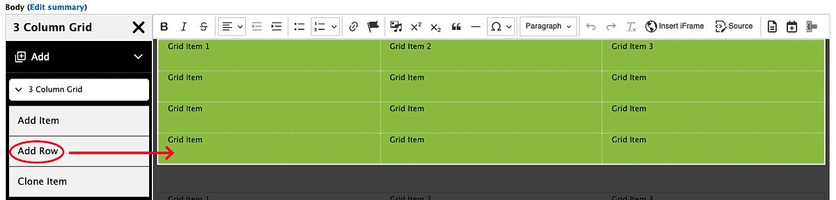
- Add Row: Adds one row to the grid. A 3 Column Grid will add a row that includes three grid items.
Clone Item: This option clones the first item in a grid and adds it to the end of the grid as a new grid item. If the item you want to clone is not in the first position, move the grid item into the first position (at least temporarily) in order to clone it. You may need to delete empty grid items between the original and the clone.
This feature is especially useful if you have created a special layout that is not available as a template item, or have heavily customized an item. For standard template items, it may be easier to insert a fresh template using the UO Edit Suite Templates button rather than cloning a grid item.
Note: Additional options may be available in the Add section of the menu if you have inserted template items, such as the Card template.
Style
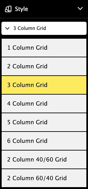
The "Style" portion of the menu allows you to convert an existing grid to a different style by selecting any of the menu options.
Grids are available in one- to six-column styles. A maximum of four columns is recommended for basic pages with a sidebar menu.
In the example below, the 3 Column Grid style is selected.
A 2 Column Grid will have two columns of equal width by default. You can also select a 40/60 or 60/40 split for 2 Column Grids by selecting "2 Column 40/60 Grid" or "2 Column 60/40 Grid" at the bottom of the Style menu.
Background Color
The "Color" section of the menu allows you to select a UO brand background color for grids and grid items.
Use these background colors sparingly for strategic impact. Avoid adding background colors when those colors will make it harder for your site users to read your content.
Edit All Grid Items: Right-Click and Select "Edit (#) Column Grid"
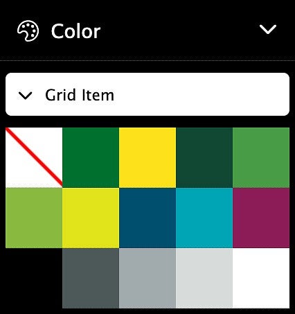
Click on the Color option in the menu.
There are two sections that allow you to choose background colors: "(#) Column Grid", and "Grid Item (Group)". (The example below is from a 3 Column Grid, so the "(#) Column Grid" option says "3 Column Grid".)
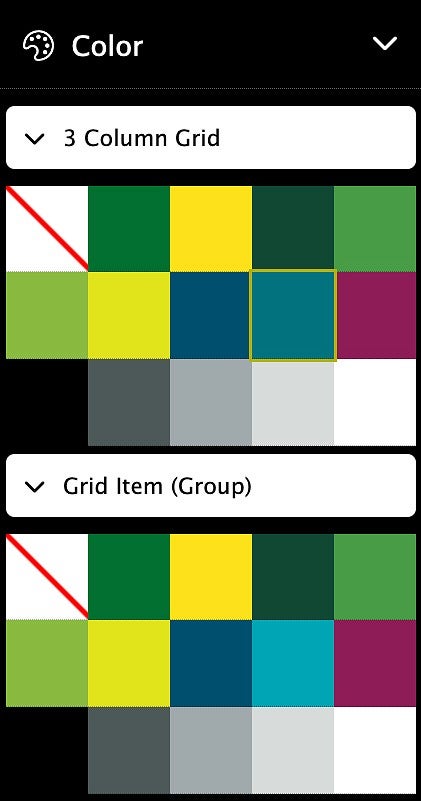
What's the difference between the first option and the second option?
Option 1
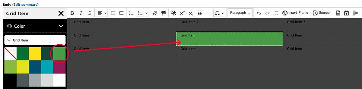
Select a color from the top section labeled "(#) Column Grid" to change the background color of the entire grid, including any new rows or grid items added after you select the color.
The example below shows how clicking a green square in the "3 Column Grid" section applies that green background color to the grid.
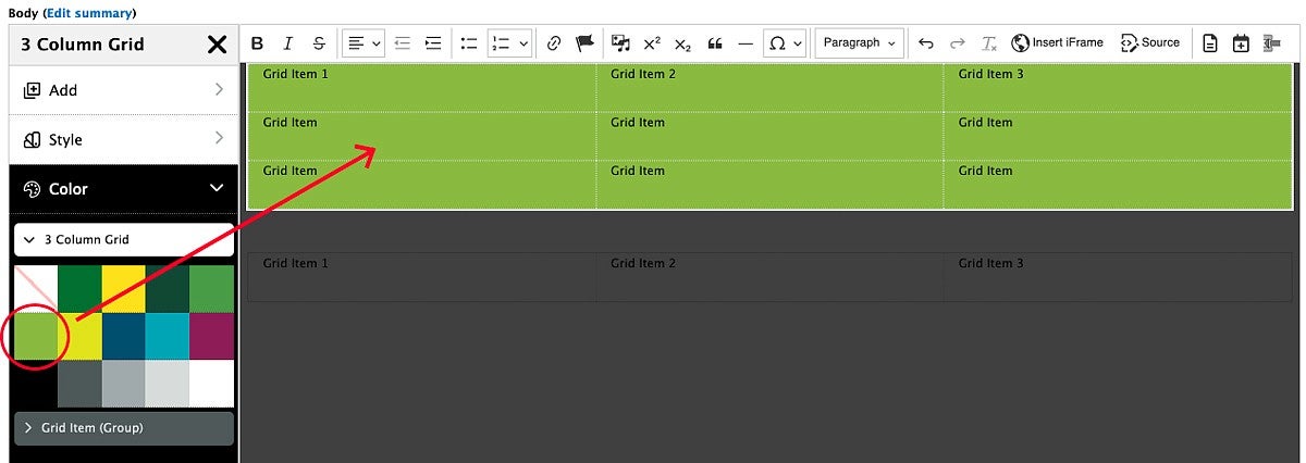
If you add any grid items or rows to the grid after selecting this color, these new items will have the same background color. The example below shows how clicking Add Row adds another row that automatically has a green background.
Option 2
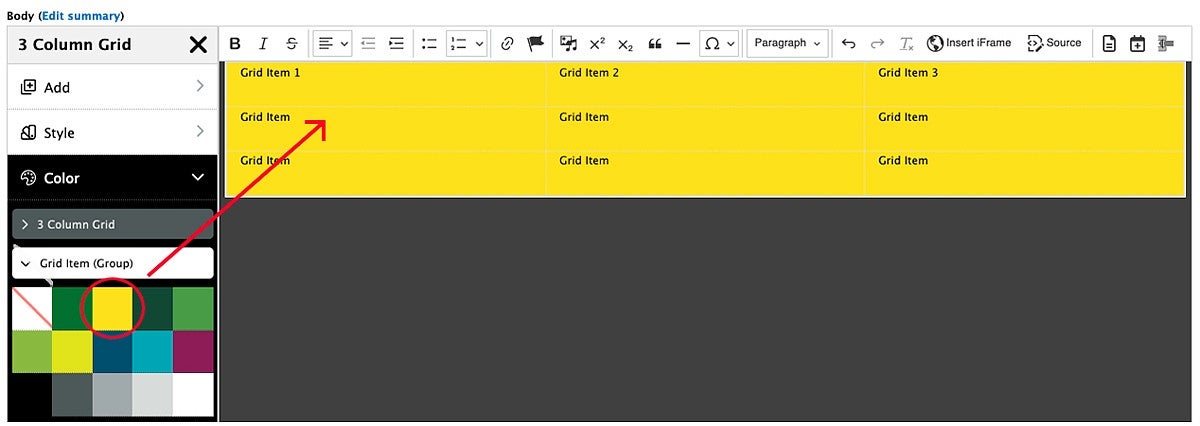
Select a color from the lower section labeled "Grid Item (Group)" to change the background color of the existing grid items. This will not change the color of any new rows or grid items added after the color is selected.
The example below shows how clicking the yellow square in the "Grid Item (Group)" section adds a yellow background color to the existing grid items.
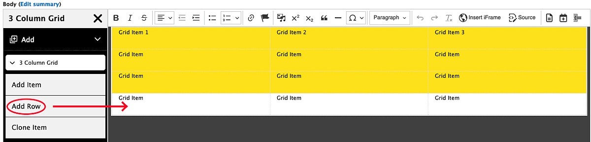
While the outcome of this will initially look the same as the Option 1 above, if you add another row, it will not have the selected color. The example below shows how clicking Add Row adds a row that does not have a yellow background.
-OR-
Edit One Grid Item: Right-Click and Select "Edit Grid Item"
Use this option to change the background color of a single grid item.
Click inside the grid item you want to edit, then right-click and select "Edit Grid Item". Click on the color in the menu that you want to add to that grid item. Other existing grid items will not be affected, and any new grid items added will not have a background color.
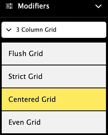
Modifiers
The "Modifiers" section of the grid editing menu allows you to change the spacing between grid items. The default setting for grids is Centered Grid.
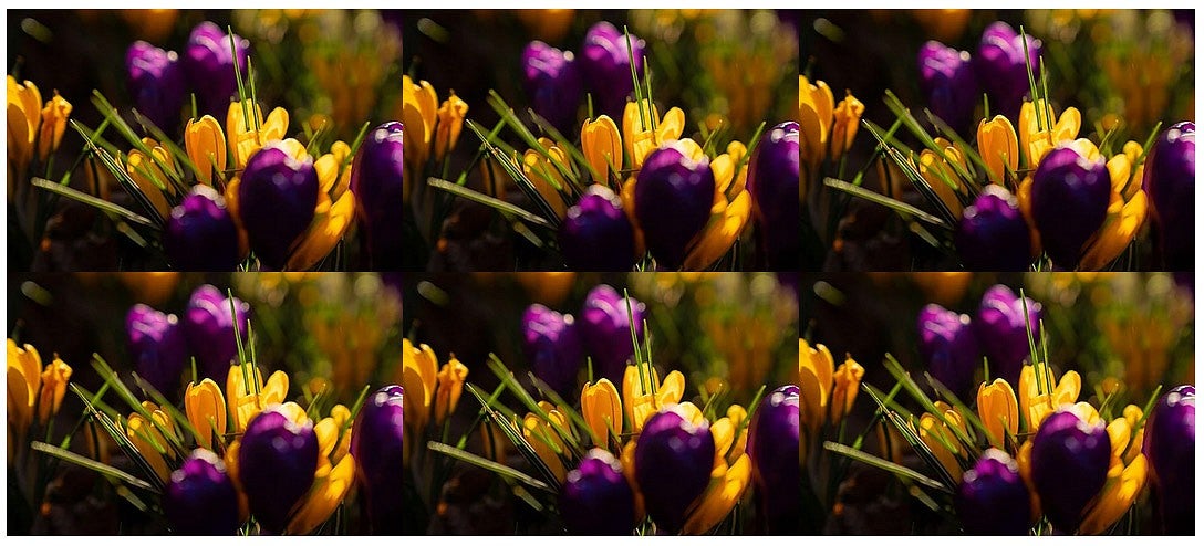
Flush Grid
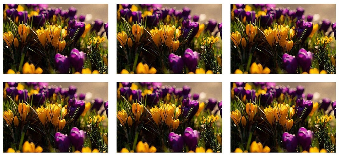
The Flush option removes the default spacing around each grid item, bringing the edges of images together:
Strict Grid
If you have an odd number of items in your grid, the last item will typically attempt to fill the width of the page. Using the Strict option, the last grid item is constrained to the same size as the other grid items:
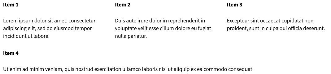
Non-Strict Example: This example shows how the text in grid item 4 stretches across the page (desktop view).
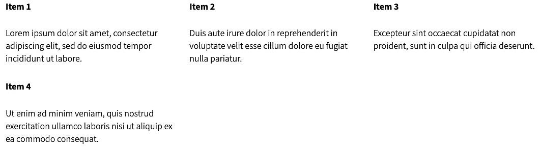
Strict Example: This example shows how the text in grid item 4 is confined to the left side of the page in line with grid item 1 (desktop view).
Centered Grid
The Centered Grid has some space between each item. If you make a browser window smaller by dragging the corner of the window, grid items will be centered as they move below other grid items.
Even Grid
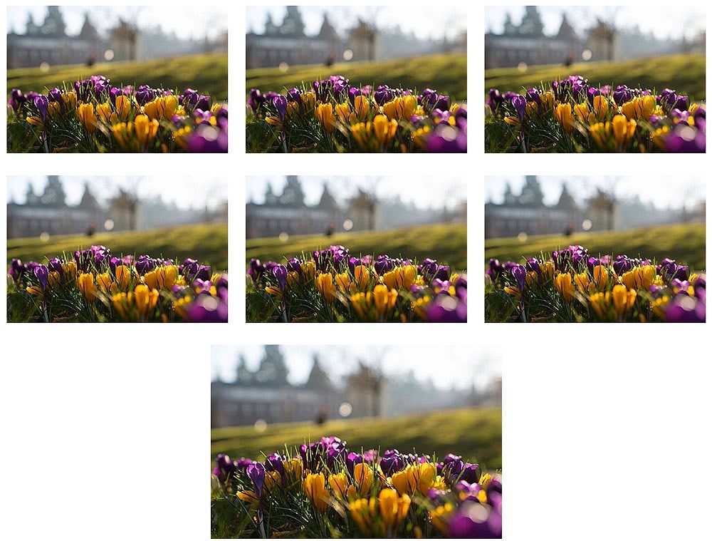
An Even Grid is similar to the Centered Grid. However, when there is a trailing grid item that is alone on a row, that item is left-justified on a Centered Grid and centered on an Even Grid as in the example below.
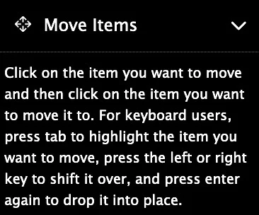
Move Items
Click on the Move Items option in the menu to move a grid item from one location in the grid to another.
Instructions in this section read, "To move an item, click on the item you want to move and then click on the item you want to move it to. For keyboard users, press tab to highlight the item you want to move, press the left or right key to shift it over, and press enter again to drop it into place."
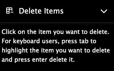
Delete Items
Click on the Delete Items option in the menu to enter delete mode. Exercise caution while in this mode because you will be able to delete items in your grid with only one click!
When you hover over areas of your grid with your mouse, the area you are about to delete is shaded red.
You can typically use the Undo button in the editor toolbar to recover an item you just deleted.
Instructions in the menu read, "Click on the item you want to delete. For keyboard users, press tab to highlight the item you want to delete and press enter delete it."
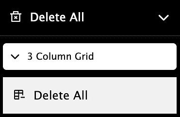
Delete All
The Delete All option in the menu allows you to delete your entire grid with one click.
When you hover over the Delete All button with your mouse, the area you are about to delete will be shaded in red.
Click the Delete All button to delete your grid. You can typically recover your deleted grid by clicking the Undo button in the editor toolbar.
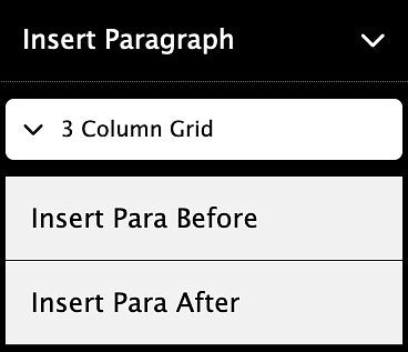
Insert Paragraph
The Insert Paragraph section of the menu allows you to insert an empty paragraph before or after your grid.
- Click "Insert Para Before" to insert an empty paragraph before your grid.
- Click "Insert Para After" to insert an empty paragraph after your grid.
Grid Examples (Change width of your browser window to see how the grids respond)
Two-Column Grid (Default)
Two-Column Grid
Column 1 of 2
Two-Column Grid
Column 2 of 2
Three-Column Grid
Three-Column Grid
Column 1 of 3
Three-Column Grid
Column 2 of 3
Three-Column Grid
Column 3 of 3
Four-Column Grid (Works best on full-width pages)
Four-Column Grid
Column 1 of 4
Four-Column Grid
Column 2 of 4
Four-Column Grid
Column 3 of 4
Four-Column Grid
Column 4 of 4
Five-Column Grid (Should be used only on full-width pages)
Five-Column Grid
Column 1 of 5
Five-Column Grid
Column 2 of 5
Five-Column Grid
Column 3 of 5
Five-Column Grid
Column 4 of 5
Five-Column Grid
Column 5 of 5
Two-Column Grid with 40/60 Split
Two-Column Grid with 40/60 Split
Column 1 of 2
Two-Column Grid with 40/60 Split
Column 2 of 2
Two-Column Grid with 60/40 Split
Two-Column Grid with 60/40 Split
Column 1 of 2
Two-Column Grid with 60/40 Split
Column 2 of 2